

Table of Contents
- Why Add Vibrant Color to Neutral Rooms
- Understanding the 60-30-10 Color Rule Examples
- Selecting the Best Vibrant Accent Colors for Neutral Rooms
- How to Style Colorful Throw Pillows and Soft Furnishings
- Using Accent Walls and Bold Paint for Impact
- Incorporating Colorful Area Rugs and Window Treatments
- Adding Statement Artwork and Indoor Plants
- Common Mistakes to Avoid When Adding Color
Last Updated: August 23, 2026
Why Add Vibrant Color to Neutral Rooms
Neutral rooms feel safe but miss emotional impact. According to research from DigiNerd's color psychology study, color associations are deeply wired into how we feel: red connects to love, blue to calm, green to contentment, yellow to joy. Adding vibrant color to neutral rooms isn't about risk, it's about intention.
Zillow's research on home staging demonstrates that choosing the right colors can reduce time on the market significantly. Beyond resale value, color affects how you feel daily. A 2018 study of 443 university students found that blue interiors correlated strongly with calm moods. The takeaway: the right vibrant color settles rather than overwhelms.
Most people love the idea of color but fear commitment. What if the shade looks different at home? What if it clashes? Below, we'll show you exactly how to add vibrant color to neutral rooms with confidence, using design principles professionals rely on combined with practical strategies that let you test before committing fully.
Understanding the 60-30-10 Color Rule Examples
The 60-30-10 rule is the designer's safety net. Here's how it works: 60% of your room stays neutral (walls, large furniture, flooring). 30% is a secondary color that complements your neutral. The remaining 10% is your vibrant pop, the color that makes the room feel alive.
Your neutral creates calm. Your secondary color creates flow. Your 10% creates personality. If your walls are soft gray (60%), your sofa might be warm taupe (30%), and your accent pillows or statement chair become jewel-tone emerald or deep terracotta (10%). The math feels restrictive until you realize it's liberating: you know exactly how much boldness the room can absorb.

Pulp Design Studios worked with a Queen Anne residence where homeowners introduced vibrant color through textiles, artwork, and accessories while keeping architecture neutral. The result was lively and strong because the 60-30-10 rule worked quietly in the background. This framework works regardless of which specific colors you choose.
| Design Element | Percentage | Example |
|---|---|---|
| Base Neutral (walls, large furniture) | 60% | Soft gray, cream, warm beige |
| Secondary Color (sofa, larger pieces) | 30% | Taupe, light sage, warm white |
| Vibrant Accent (pillows, art, plants) | 10% | Emerald, terracotta, navy, sapphire |
Selecting the Best Vibrant Accent Colors for Neutral Rooms
The best vibrant accent colors for neutral rooms have intentional undertones that either warm or cool your space. According to RMCAD's 2025 Color Trends report, interior designers are bringing the natural world indoors with deep, earthy colors that add peace rather than chaos.
Research from 30 countries involving 4,598 participants found consistent associations: black linked to sadness, white to relief, red to love, blue to calm, green to contentment, yellow to joy, purple to pleasure, and orange to joy. When you select a vibrant accent color, you're selecting an emotional tone.
For neutral rooms, the strongest vibrant choices fall into three categories:
Jewel Tones (sapphire, emerald, amethyst) create sophistication and feel rich without heaviness. Warm Earth Tones (terracotta, rust, burnt sienna, deep olive) create coziness and harmonize naturally with neutrals. Saturated Primaries (deep navy, true red, golden yellow) create confidence and work best in smaller doses.
The key is undertone matching. If your neutral has warm undertones (cream, warm gray, beige), pair it with warm vibrant colors. If your neutral leans cool (cool gray, soft white with blue undertones), cool vibrant colors feel natural. Hannah Yeo, Senior Manager of Color Marketing at Benjamin Moore, notes: "Incredibly versatile, neutral hues have endless potential to transform a home. Their true beauty lies in the rich array of undertones they offer."
How to Style Colorful Throw Pillows and Soft Furnishings
Throw pillows are the fastest way to add vibrant color without commitment. They're affordable, replaceable, and instantly transformative.
Layer three to five pillows in varying sizes, textures, and shades within your chosen color family. A deep emerald pillow next to lighter sage creates depth. Add a textured cream pillow for contrast. Include a patterned throw that pulls multiple colors together. Texture matters as much as color: matte velvet reads differently than glossy silk in the same shade. Mix linen, cotton, wool, velvet, and silk.
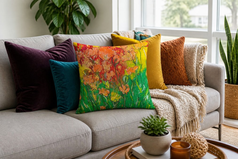
theJoyincolor's accent pillows are designed for this layering approach, featuring machine-washable cases with shape-retaining inserts so you can test colors without permanent commitment. The hidden zipper keeps the look clean, and 100% polyester construction ensures durability.
Betsy Wentz, Interior Designer at Betsy Wentz Interior Design, describes her approach: "I enhance a neutral space with bold, eye-catching pieces like a statement light fixture or art. From there, I layer in textures, patterns, and colors through furniture and accessories." For placement, anchor pillows at corners and center of your sofa. Vary heights by mixing square pillows with lumbar rectangles. Odd numbers (three, five) feel more intentional than even numbers.
Using Accent Walls and Bold Paint for Impact
An accent wall is the most dramatic way to add vibrant color if you're ready for commitment. Choose the wall that's your focal point, typically behind your sofa, bed, or the wall you see first entering. Paint that wall in your vibrant color. Keep the other three walls neutral.
The risk is choosing a color too bright or saturated for the room size. A neon chartreuse might feel energizing in a showroom but exhausting in your bedroom. Buy a quart of paint, paint a large swatch on your accent wall, and live with it for three days under different lighting conditions. Morning, afternoon, and evening light will all shift how the color reads.
According to research on color and mood in residential spaces, people expressed color as important in interior design, with preferences varying based on room size, natural light availability, and material quality. Test swatches in your actual room under actual lighting. If full-wall commitment feels risky, consider a partial accent wall, painting just the upper two-thirds and leaving a neutral border at the bottom.
Incorporating Colorful Area Rugs and Window Treatments
An area rug grounds a room and defines space. Choose one that contains your vibrant accent color alongside neutral tones. If your accent color is deep emerald, a rug with emerald, cream, and warm gray creates cohesion.
Size matters. A rug too small makes a room feel fragmented. Aim for a rug large enough that at least the front legs of your sofa sit on it. In a living room, this typically means a 5x8 or 6x9 rug. A properly sized rug creates visual continuity.
Window treatments are equally powerful. Curtains or drapes in a vibrant color frame windows and draw the eye upward, making rooms feel larger. Sheer curtains in bold hue filter light beautifully. Heavier fabrics in jewel tones create drama. If your rug is vibrant, keep curtains neutral or use a complementary secondary color. You're distributing color throughout the room, not concentrating it in one place.
Adding Statement Artwork and Indoor Plants
Artwork is where vibrant color becomes personal. Choose artwork that features your vibrant accent color prominently but includes neutral tones for balance. A painting with deep sapphire, cream, and warm gray works better than pure sapphire on white.
Gallery walls amplify this effect. Mix framed prints, paintings, and photographs in varying sizes. Include frames in natural wood, black, and white to create visual rhythm. A gallery wall becomes a focal point that justifies your vibrant color choices throughout the room.
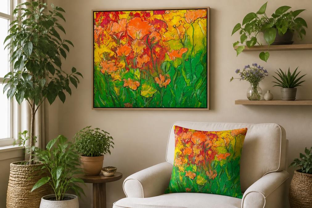
Indoor plants add color that's alive and changing. Green is the most versatile vibrant color for neutral rooms because it's both bold and natural. A large fiddle leaf fig or monseta in the corner becomes sculpture. Smaller plants on shelves create layering. Flowering plants like orchids or bird of paradise add unexpected color. Rotate seasonal plants for vibrant color that changes without permanent commitment.
Common Mistakes to Avoid When Adding Color
The biggest mistake is adding too much vibrant color at once. Restraint is harder than abundance but separates designed rooms from decorated ones.
The second mistake is ignoring undertones. A "gray" wall paired with a "blue" accent pillow should work, but if the gray leans warm and the blue leans cool, they create visual tension that reads as a mistake. Always test colors together in your actual space.

A third mistake is choosing trendy colors without considering longevity. According to research from Peak Residential Inc., vibrant colors can quickly become outdated and overstimulating. Choose colors with staying power: jewel tones, deep earth tones, and saturated primaries age better than neon or pastel trends.
People also forget that badly combined neutrals feel dissatisfying and lack personality. If using multiple neutrals, ensure they share similar undertones so they feel cohesive. Finally, avoid forgetting about lighting. A vibrant color perfect in daylight might feel completely different under evening artificial light. Test colors at different times of day. If a room has limited natural light, lean toward warmer vibrant tones that feel inviting rather than cool tones that can feel cold.
Adding vibrant color to neutral rooms is about intention, not impulse. The challenge most people face is fear of choosing wrong, fear of commitment, fear of clashing. But the data is clear: color affects mood, emotion, and how we experience our spaces. The right vibrant accent completes a neutral room.
theJoyincolor's curated collection of accent pillows, like the Boho Accent Pillow and Placemat Set, makes testing color combinations affordable and reversible. Start with one piece. Layer in complementary shades. Build your room's personality gradually. This approach removes risk while keeping the reward of living in a space that reflects who you are.

===
Frequently Asked Questions
What is the 60-30-10 color rule in interior design?
The 60-30-10 rule is a design principle where 60% of your room uses a dominant neutral color, 30% uses a secondary color, and 10% uses an accent color. This formula prevents overwhelming your space while maintaining visual harmony. When adding vibrant color to neutral rooms, your neutrals stay dominant, your secondary color introduces warmth, and your 10% accent color, like jewel tones or terracotta, creates the vibrant pop that brings personality to your space.
How do I add vibrant color without painting an accent wall?
Colorful throw pillows, area rugs, artwork, and window treatments offer instant color without permanent commitment. Accent pillows like the [Mothers Day Accent Pillow](https://thejoyincolor.myshopify.com/products/mothers-day-accent-pillow) or [Boho Accent Pillow](https://thejoyincolor.myshopify.com/products/boho-accent-pillow) ($17.13 each) provide strategic pops of color that transform neutral sofas. Layer in bold textiles, statement lighting fixtures, and indoor plants. These soft furnishings create visual interest and allow you to rotate colors seasonally without the cost or effort of repainting.
What vibrant colors work best with gray or beige neutrals?
Deep jewel tones like emerald, sapphire, and amethyst create sophisticated contrast against gray. With beige, warm earth tones like terracotta, rust, and deep olive green add richness. Research shows blue interiors are preferred for their calming effect, while red creates energy and green promotes contentment. Consider complementary shades on the color wheel, if your neutral leans cool, warm tones pop more vividly, and vice versa.
How can I test if a vibrant color will work before committing?
Start small with reversible items: accent pillows, throws, and artwork. This low-risk approach lets you see how colors interact with your lighting and existing furnishings. Order a few pieces, live with them for a week, and assess how they feel in different times of day. If the color doesn't work, swap it out without loss. Textiles and decor are far easier to change than paint, making them ideal for experimenting with your color palette.
This article was written using GrandRanker