

Table of Contents
- Pick the Wall First, Then the Vibrant Accent Wall Color
- Pull a Vibrant Shade From What You Already Own
- Bold Accent Wall Color Ideas by Hue Family
- How to Test Paint Colors on a Wall Before You Commit
- How to Coordinate Wall Color With Furniture and Decor
- Balance a Bold Wall So It Does Not Overwhelm the Room
- Finish, Sheen, and Surface Prep for a Vibrant Accent Wall
- Conclusion
- Frequently Asked Questions
Last Updated: October 13, 2026
Pick the Wall First, Then the Vibrant Accent Wall Color
Choose the wall before the paint. The wall decides how much light hits the color, how much of it you see at once, and whether the shade reads bold or muddy. Get that order wrong and even a perfect color falls flat.
Here is the order that works:
- Pick the wall.
- Check the light on that wall.
- Choose the color.
- Test it in place.
- Paint.
This guide walks through each step, plus the color families that hold up best and how to keep a bold wall from taking over.
Which wall makes the best focal point
The best focal point is a wall with a natural reason to be noticed: a fireplace wall, a headboard wall, or the wall you face when you walk in. Those walls already carry weight, so color amplifies rather than invents.
Skip walls that fight for attention:
- Walls broken up by doors, closets, or a hallway opening
- Short stub walls that end mid-room
- Walls hidden behind a sofa or a tall bookshelf
One long, unbroken wall beats three small ones every time. Architectural Digest's guide to accent walls makes the same point: the wall has to earn the color.
How room size and light direction affect your choice
Room size and window direction change how a color reads more than the color itself. A north-facing room gets cool, flat light all day, turning warm shades gray.
Small rooms need more care: a dark shade on one wall can shrink them further, so keep the other three walls light and let the accent carry the contrast.
Big rooms handle more. A large living room can take a deep navy or charcoal wall without feeling closed in, because the eye has space to rest.
Test light at three times of day before you commit:
- Morning, when sun hits the wall directly
- Afternoon, when light shifts and softens
- Evening, under your actual lamps
Pull a Vibrant Shade From What You Already Own
The most reliable way to choose a vibrant accent wall color is to steal it from the room: look at what is already there and pull one bold shade out of it.
Walk the room and note every color you already live with:
- A pattern in a rug or a cushion
- A vein in a stone countertop
- A glaze on a ceramic vase
Pick the boldest color in that list, then find a matching paint chip. The wall now ties to things you already chose, so it cannot clash, and you are not guessing under bad store lighting.
Our Boho Accent Pillow is a good example of this in reverse: a multicolor abstract print that gives you three or four shades to pull a wall color from.

Bold Accent Wall Color Ideas by Hue Family
Group your options by hue family first, then narrow within it. Warm and cool tones behave differently, and knowing which family fits your space cuts the list fast.
Start by identifying the undertone of what you cannot change, flooring, tile, countertops, cabinets. Oak and hickory run warm with a yellow-orange bias; gray-washed wood runs blue-gray; travertine and beige tile lean warm; marble and most quartz lean cool.
| Hue Family | Example Shades | Undertone Bias | Best For | Pairs Well With |
|---|---|---|---|---|
| Warm | Terracotta, burnt sienna, mustard, coral, rust | Red-orange to yellow | North-facing rooms, cozy bedrooms, rooms with oak or warm wood floors | Cream, warm gray, brass, natural linen |
| Cool | Navy, teal, emerald, peacock, cobalt | Blue-green to blue-violet | South-facing rooms, home offices, rooms with cool gray or marble surfaces | White, chrome, charcoal, silver |
| Deep neutral | Charcoal, near-black, deep olive, aubergine | Varies; olive leans yellow-green, aubergine leans red-violet | Large rooms, dining spaces, rooms that need a grounding anchor | Almost anything, but test against your floor first |
Warm tones: terracotta, mustard, coral
Warm tones bring energy and work hardest in cold or dim rooms. Terracotta reads earthy, mustard adds a retro edge, and coral is the boldest, best saved for a small wall.
These shades pair with wood, linen, and cream, and fight cool gray. Warm walls make warm wood floors look richer and cool wood floors look slightly yellow, so check the floor-to-wall relationship before you commit.
Cool tones: navy, teal, emerald
Cool tones feel calmer and more formal. Navy is the safest bold choice for almost any room; teal works well in bathrooms and bedrooms; emerald is the most dramatic and suits a dining room or study.
Cool shades pair with white, brass, and charcoal, and handle south-facing light well because it warms them up. The trade-off: they can make a cool-toned room feel chilly in winter, so add a warm textile or wood element.
Deep neutrals: charcoal, near-black, deep olive
Deep neutrals are the most versatile bold choice because they read as color without committing to a hue. Charcoal and near-black make artwork and furniture pop; deep olive adds an earthy feel and works well with brass and leather.
Deep neutrals absorb light rather than reflect it, so they make a room feel intimate and can shrink a small space.
How to Test Paint Colors on a Wall Before You Commit
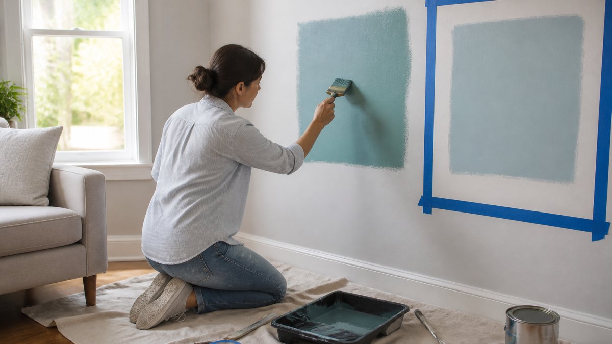
The only test that counts is paint on your actual wall, in your actual light. Paper swatches and store samples lie because they are viewed under different light. Paint a large patch and live with it for several days, watching how it shifts.
Why light changes the color you see
Light has a color temperature, measured in kelvin (K): higher numbers are cooler and bluer, lower numbers warmer and more yellow-orange. This is why the same paint can look vibrant at noon and muddy at 9 p.m.
- Daylight at midday: roughly 5000K to 6500K, cool and neutral to slightly blue
- Daylight at sunrise and sunset: roughly 2000K to 3000K, warm and orange
- Incandescent bulbs: roughly 2700K, warm and yellow
A warm bulb (2700K) makes terracotta glow and navy look almost black; a cool bulb (5000K) makes navy truer and mustard look slightly green. That is not a paint defect, it is the light doing the work.
Direction of daylight matters too
- North-facing windows: cool, indirect light all day. Warm shades go gray and flat. Cool shades hold their color.
- South-facing windows: strong, warm light most of the day. Saturated colors glow and can push too bright. Cool shades get warmed up.
- East-facing windows: warm, bright light in the morning, cooler and dimmer by afternoon.
The testing protocol
Follow this so you are evaluating the color, not the light:
- Clean the wall and let it dry fully.
- Paint a patch at least 2 feet by 2 feet, bigger is better, and 3 feet is more honest.
- Paint two coats so the color reads true; one coat over a previous color will not represent the final result.
- Leave the patch unpainted at the edges so you can compare against the existing wall.
- Check it at four times: morning, midday, late afternoon, and night with your actual lamps on.
- Look at it from the doorway, across the room, and up close.
- Note how it looks next to your flooring, furniture, and trim, not just against the wall.
Most paint brands sell small sample pots for a few dollars, which is far cheaper than repainting a whole wall. Consumer Reports on testing paint samples recommends testing on the wall rather than on paper for exactly this reason.
How to Coordinate Wall Color With Furniture and Decor
Coordinate by contrast, not match. A bold wall should set off your furniture, not blend into it.
Use the 60-30-10 rule as a starting point:
- 60 percent: the dominant neutral (walls, large furniture)
- 30 percent: a secondary tone (rug, curtains, upholstery)
- 10 percent: the accent (the bold wall, plus small decor)
Keep the other three walls neutral so the accent wall has something to push against, then repeat the accent color in small doses: a cushion, a vase, a frame.
Our Darkness to Light Accent Pillow does this job well. It carries a multicolor abstract print, so it echoes a bold wall without matching it exactly.

Balance a Bold Wall So It Does Not Overwhelm the Room
A bold wall overwhelms a room when it is the only thing in it. Balance comes from giving the eye somewhere else to go.
Try these moves:
- Keep the other three walls a quiet neutral
- Add texture: a woven rug, a linen curtain, a wood surface
- Repeat the accent color in two or three small objects
Scale matters too. A deep shade on a huge wall in a small room will feel heavy no matter what you do. In that case, paint a smaller wall or use the color below a chair rail instead.
Finish, Sheen, and Surface Prep for a Vibrant Accent Wall
Sheen changes how a color reads, and prep decides whether it lasts. Both get ignored, and both matter more on a bold wall because flaws show up faster.
Pick sheen by room:
- Matte or flat: hides wall flaws, best for low-traffic rooms
- Eggshell: easy to wipe, good for living rooms and hallways
- Satin: durable, best for kitchens and kids' rooms
Prep steps before you paint:
- Fill nail holes and cracks with spackle.
- Sand the patches smooth.
- Wipe the wall clean and let it dry.
- Tape the trim and edges.
- Prime if you are going from dark to light or over a patchy surface.
- Cut in the edges, then roll the field.
Higher sheen shows every bump, so prep carefully if you choose satin or above; flat forgives more.
Conclusion
Choosing a vibrant accent wall color comes down to order: wall first, light second, color third, test fourth. Skip a step and you repaint.
Our accent pillows come with a machine-washable case and a shape-retaining insert, so they stay looking sharp long after the paint dries. Browse the collection and find the piece that ties your bold wall together.
Frequently Asked Questions
How do I choose a color for an accent wall?
Start with the wall itself. Pick a surface that already draws the eye, such as the wall behind a bed or sofa, then choose a vibrant accent wall color pulled from something already in the room: a rug, an artwork, or a patterned cushion. Testing oversized samples in daylight and at night confirms the shade before you buy a full gallon.
Should an accent wall be lighter or darker than the other walls?
Darker is the safer default. A deeper shade on one wall creates contrast and depth while keeping the other three walls calm. Lighter accent walls only work when the surrounding walls are already saturated, otherwise the accent wall reads as unfinished rather than intentional.
Can a vibrant accent wall make a room look smaller?
It can if you choose the wrong wall. Painting a wall that faces the main sightline draws it closer and can shrink the perceived space. Paint the wall behind the furniture you face instead, or use a cooler, less saturated shade. Cool tones and lower saturation recede, so they keep the room feeling open.
How do I coordinate an accent wall with rugs, artwork, and decor?
Use the 60-30-10 rule: 60 percent of the room in a neutral base, 30 percent in a secondary color, and 10 percent in the vibrant accent. Pull the accent wall shade directly from your rug or artwork so the color already exists in the room. Then repeat that same shade in two or three small pieces, such as an accent pillow, to tie the scheme together.
Most bold-wall projects fail at the testing stage, not the color stage. If you want decor that supports the shade you chose instead of fighting it, theJoyincolor has you covered. Our accent pillows bring a multicolor print into the room, with a machine-washable case and a shape-retaining insert for everyday use. Get started with theJoyincolor and build a room where the color actually works.