

Table of Contents
- Start With the 60-30-10 Color Rule
- Building a Living Room Color Scheme That Works
- How to Use Bold Paint Colors on Walls and Ceilings
- Mixing Patterns in Living Rooms Without Clashing
- Balance Bold Colors With Neutral Elements
- Bold Colors in Small Spaces
- Budget-Friendly Ways to Introduce Bold Color
- Maintaining and Updating Bold Color Choices
Last Updated: August 27, 2026
Start With the 60-30-10 Color Rule
The 60-30-10 rule is a foundational design principle that allocates 60% of your space to a dominant color, 30% to a secondary hue, and 10% to accent colors. It's not rigid, but a framework that prevents bold color schemes from feeling chaotic. According to interior design research from Homes and Gardens, experimenting with contrast through strategic color proportions is gaining significant appeal in 2025. Your dominant color creates visual rest, your secondary hue adds depth, and your 10% accent colors deliver personality.
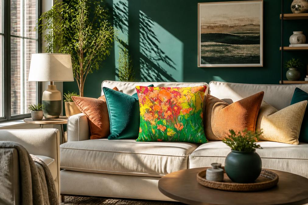
The rule works by creating hierarchy. A deep forest green on 60% of your walls becomes a sophisticated backdrop. A warm terracotta secondary color on 30% (through furniture or a large area rug) adds warmth and movement. Then your 10% accent colors, perhaps vibrant mustard yellow or coral through pillows and art, become memorable focal points.
Building a Living Room Color Scheme That Works
A cohesive living room color scheme starts with understanding which colors complement each other and how they interact in your specific space. Lighting, wall texture, and existing furniture all influence how colors appear once applied.
Choose Your Dominant Color
Your dominant color should be something you genuinely love because you'll see it constantly. This is typically your wall color or large furniture pieces. According to color trends from Staggs Interiors, bold colors are making a major comeback in 2025, with deep blues and greens becoming go-to choices for creating cozy, sophisticated spaces.
Deep blues work particularly well in living rooms because they feel both calming and substantial. Dark browns have emerged as another on-trend dominant color, offering warmth without heaviness. When selecting your dominant color, consider the mood you want. Cool-toned dominants (blues, greens, purples) create calm spaces. Warm dominants (terracottas, warm browns, deep oranges) feel energizing and inviting.
Select Your Secondary Hues
Your secondary color occupies roughly 30% of the visual space and should create contrast with your dominant color without clashing. If your dominant is a cool blue, a warm secondary like burnt orange or rust creates intentional visual tension. The secondary color often appears through larger furniture pieces: a sofa, area rug, or substantial artwork.
Ruth Mottershead, Creative Director at Little Greene, explains: "It can be tempting to opt for neutral colors within your home, but introducing bolder hues will create a dynamic and vibrant space full of personality and charm. Even in smaller spaces where more impactful colors are often avoided in fear of being too overwhelming, ensuring the ratio is just right will deliver a harmonious space that has depth and interest."
Add Accent Colors for Pop
Accent colors are your creative playground. These 10% elements make a room feel personal and alive through pillows, throws, artwork, plants, and decorative objects. If your living room uses 60% deep teal and 30% warm gray, your accent colors might include mustard yellow, coral, and touches of white. The beauty of accent colors is that you can change them seasonally without altering the foundational scheme.
How to Use Bold Paint Colors on Walls and Ceilings
Paint is the most impactful and cost-effective way to introduce bold color into a living room. A single bold wall can transform the entire space.
Accent Walls vs. Full Room Commitment
An accent wall uses bold color on one wall while keeping others neutral or lighter. This approach is lower-risk and works well in smaller spaces by creating a focal point without overwhelming the room. A full-room commitment means painting all four walls in your bold color, which works best in larger living rooms with good natural light and when you're confident about your color choice.
Interior design research shows that bold colors can be challenging to get right, and too much can feel overwhelming. The solution isn't avoiding bold color, it's balancing it thoughtfully. Dark colors, when balanced with lighter elements and adequate lighting, create cozy, intimate atmospheres that feel intentional rather than cramped. Consider starting with an accent wall if you're uncertain.
Understanding Sheen and Finish
Paint sheen affects how bold a color appears and how light bounces around the room. A matte finish absorbs light and makes bold colors feel deeper and more sophisticated. A gloss or semi-gloss finish reflects light and makes colors appear more vibrant.
For living rooms, an eggshell or satin finish strikes a balance. It's durable, has slight sheen that adds dimension to bold colors, and is easier to clean than matte. If you're using a very dark or saturated bold color, matte prevents the room from feeling too shiny. If you want your bold color to feel energetic, semi-gloss brings out vibrancy. Test your chosen color in multiple sheens before committing.
Mixing Patterns in Living Rooms Without Clashing
Pattern is where bold color schemes truly come alive. A room with solid colors can feel flat. Pattern adds texture, visual interest, and personality. The key to mixing patterns successfully is understanding scale and maintaining color harmony.
Vary Pattern Scale and Type
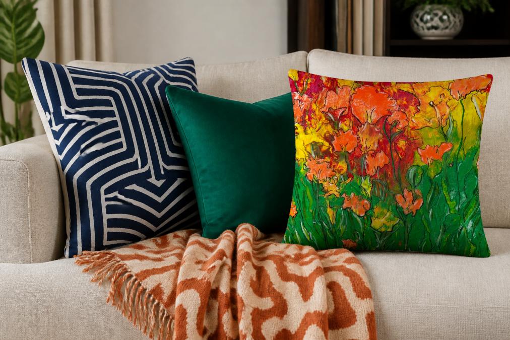
Mixing patterns requires intentional variation in scale. A large-scale geometric pattern paired with a small-scale geometric pattern can feel chaotic. Instead, pair a large-scale pattern with a small-scale pattern, or mix pattern types: geometric with floral, abstract with striped.
According to interior design trends from Inside Stories, color, pattern, and texture are becoming a staple in today's interior design. A practical approach: choose one dominant pattern (perhaps a large geometric on a sofa or rug), one secondary pattern (medium-scale floral or striped on pillows), and one accent pattern (small-scale geometric on a single pillow or artwork). The color palette should tie patterns together, if your patterns share a common color, they'll feel cohesive even if pattern types differ.
Use Geometric Shapes and Textural Layers
Geometric patterns feel modern and graphic. They work particularly well with bold colors because clean lines create structure. Textural layers, mixing smooth, rough, woven, and plush textures, add dimension that solid colors alone cannot achieve.
A living room might layer a smooth velvet sofa in deep blue, a woven jute rug, linen pillows with geometric prints, a chunky knit throw, and smooth ceramic accessories. Each texture catches light differently and creates visual complexity.
Isabel Ladd, Interior Designer at Isabel Ladd Interiors, describes her approach: "For me, design is intuitive. My Brazilian roots deeply impact my color sensibility and the carnival-like kaleidoscope of my creative brain. A girl of many mantras, I love to preach: 'Beige is not a color. More is More; Less is a Bore. And above all else: Mix. Don't Match.'"
Balance Bold Colors With Neutral Elements
Bold colors need breathing room. Neutral elements prevent a space from feeling chaotic and give the eye places to rest. Neutrals include whites, creams, grays, soft taupes, and warm beiges.
A living room with bold walls, patterned furniture, and colorful accessories needs neutral grounding through a light-colored sofa, white trim, a neutral area rug with bold pattern accents, or light window treatments. Think of neutrals as the silence between musical notes. Without silence, music becomes noise. Without neutral space, bold colors become visual chaos.
Bold Colors in Small Spaces
Small living rooms can handle bold colors beautifully when approached strategically. The conventional wisdom that dark or bold colors make small spaces feel smaller is outdated. What matters is light, proportion, and how colors interact with your specific room's dimensions.
A small room with good natural light can carry a bold color on all four walls. A small room with limited natural light benefits from a bold accent wall paired with lighter walls and plenty of white trim. The key is using bold color to create intentional interest rather than cramped feeling. A small living room painted in deep jewel tones with strategic lighting becomes intimate and sophisticated, not claustrophobic.
Vertical visual lines help small spaces feel larger. A bold color on walls paired with tall mirrors or floor-to-ceiling shelving creates upward movement. In small spaces, avoid too many competing patterns. Stick closer to the 60-30-10 rule for clarity rather than visual clutter.
Budget-Friendly Ways to Introduce Bold Color
You don't need to repaint your entire living room to embrace bold color. Strategic, affordable choices can transform your space.
Start with textiles. Bold throw pillows, area rugs, and blankets introduce color and pattern without permanent commitment. theJoyincolor's Mothers Day Accent Pillow ($17.13) and Darkness to Light Accent Pillow ($17.13) offer vibrant, machine-washable options that bring bold color without furniture commitment.


Artwork and wall hangings are another budget-friendly approach. A large-scale abstract print or gallery wall in bold colors can anchor your color scheme without paint. Plants bring natural color and texture inexpensively. For dining areas, theJoyincolor's Placemat Set ($40.52) comes with four water-resistant placemats in unique patterns, adding bold color to your dining experience.

Paint remains the most impactful budget option. A single accent wall costs significantly less than furniture or extensive decor updates and lasts for years.
Maintaining and Updating Bold Color Choices
Bold colors require intentional maintenance to keep them looking fresh. Sunlight fades paint over time, particularly on walls receiving direct sun. Consider UV-protective window treatments to preserve color intensity.
Dust accumulates differently on bold colors than neutrals. Deep colors show dust more readily, requiring more frequent cleaning. A slightly higher-sheen paint finish (satin or semi-gloss) makes cleaning easier than matte.
Textiles fade with use. Rotate pillows and throws periodically to ensure even fading. Machine-washable options like theJoyincolor's accent pillows extend the life of your bold color investments. Updating bold color schemes doesn't require starting over. Swap accent colors seasonally, replace pillows while keeping walls consistent, or add new artwork to refresh without repainting.
Bold colors in living rooms aren't reckless design choices, they're intentional statements that reflect personality and create spaces worth spending time in. The 60-30-10 rule, thoughtful pattern mixing, and strategic balance with neutral elements transform bold color from intimidating to achievable. Start with one element: paint an accent wall, invest in bold pillows, or add artwork in colors that excite you. Your living room should feel like you. At theJoyincolor, we believe vibrant, personalized spaces improve daily life. Begin with one bold choice and build from there.
Frequently Asked Questions
What are some bold colors that work well in a living room?
Deep blues, rich greens, dark brown, and jewel tones like emerald and sapphire are trending bold choices for living rooms in 2025. Deep blues and greens are particularly popular for creating cozy effects, while dark brown adds sophisticated warmth. The key is choosing colors with enough saturation and intensity to make a statement without feeling chaotic. Consider your room's natural light and existing furniture before selecting your palette.
How do I balance bold colors without overwhelming my living room?
Use the 60-30-10 color rule: 60% neutral base (walls, large furniture), 30% secondary color, and 10% bold accent color. This prevents your space from feeling too intense while still allowing bold hues to shine. Pair bold paint or large furniture pieces with neutral elements like white trim, light-colored sofas, or cream textiles. Strategically placed accent pieces like pillows or artwork let you introduce multiple bold colors in controlled doses.
What color mistakes should I avoid in my living room?
Avoid using too many bold colors at full saturation, which creates visual chaos. Don't ignore undertones when mixing colors, clashing warm and cool tones can feel jarring. Skip painting all four walls in bold color if your room is small or lacks natural light. Avoid overwhelming patterns paired with bold wall colors simultaneously. Finally, don't neglect balance: ensure neutrals anchor your bold choices so the room feels intentional rather than random.
Can I use bold colors in a small living room?
Yes, but strategically. Dark or bold colors can actually create an intimate, cozy atmosphere in small spaces when balanced correctly. Use bold colors on a single accent wall rather than all walls. Pair dark hues with plenty of light-colored textiles, white trim, and reflective surfaces to prevent the room from feeling cramped. Incorporate strategic lighting to brighten the space and let bold colors feel energizing rather than confining.
This article was written using GrandRanker