

Table of Contents
- Understanding Color Theory Basics for Home Design
- How to Use a Color Wheel for Home Decor
- The 60-30-10 Color Rule for Balanced Interiors
- How to Choose Accent Colors for a Room
- Step-by-Step: Mixing Colors in Your Home
- Common Mistakes to Avoid When Mixing Colors
- How Lighting Affects Color Perception in Your Space
- Mixing Colors for Small vs. Large Spaces
- Frequently Asked Questions
Last Updated: September 24, 2026
Understanding Color Theory Basics for Home Design
Color theory forms the foundation for how to mix colors in home interior design. The relationship between hues, saturation, and value determines whether your space feels cohesive or chaotic.
A room painted in cool grays reads entirely different from one in warm taupes, even if the lightness level is identical. That's science, not accident.
Hue, Saturation, and Value Explained
Hue is the color itself, red, blue, green, or any position on the color wheel. Saturation measures how intense or muted that color appears. A fully saturated red is vivid; a desaturated red becomes dusty or brownish. Value refers to how light or dark a color is, independent of the hue.
You can use the same hue throughout a room by varying saturation and value, creating depth without chaos. A deep forest green accent wall, muted sage sofa, and pale mint pillows all share the same hue but feel different because of saturation and value shifts. Monochromatic schemes are forgiving and inherently balanced.
Beginners fixate on hue and ignore saturation and value. A room with three hues at full saturation looks overwhelming; the same three hues with one saturated and two muted works.
Warm Tones vs. Cool Tones
Warm tones (reds, oranges, yellows, warm browns) advance and create intimacy. Cool tones (blues, greens, purples) recede and feel expansive. This is how human perception works.
In 2026, [interior design trends(/blogs/news/colorful-interior-design-trends-2026) show a marked shift toward warmer, nature-inspired palettes | bontempi.com]. Cold minimalism and gray-dominated spaces are giving way to deep greens, warm terracottas, and rich earth tones. This reflects a broader move away from sterile interiors toward spaces that feel lived-in and grounded.
Match room temperature to purpose: bedrooms benefit from warm tones for rest, home offices from cool tones for focus, living rooms from warm base with cool accents.
Warm rooms feel smaller and intimate; cool rooms feel larger and serene. Use cool tones in cramped spaces, warm tones in cold ones.
How to Use a Color Wheel for Home Decor
The color wheel shows relationships between hues and helps you avoid pairings that feel discordant. Use it to work with predictable, proven combinations.
A standard color wheel has 12 hues. Opposite colors are complementary; adjacent are analogous; equally spaced form triadic schemes. Each produces different visual effects.
Complementary and Analogous Color Schemes
Complementary colors sit opposite on the wheel (red and green, blue and orange, yellow and purple). They create high contrast and visual excitement for dynamic spaces.
Balance complementary schemes by making one dominant and one an accent. A navy wall with coral pillows works; equal measure feels chaotic.
Analogous colors sit next to each other on the wheel (blue, blue-green, green; or red, red-orange, orange). They create harmony and are safer than complementary schemes.
Most successful interiors use analogous schemes as their foundation with complementary accents for punch. This is how to mix colors in home interior design without overwhelming the space.
Triadic and Monochromatic Palettes
Triadic schemes use three equally spaced colors (red, yellow, blue; or green, orange, purple). They're balanced and vibrant without jarring complementary pairs, working well for eclectic aesthetics.
Monochromatic schemes use variations of a single hue, different tints, shades, and tones of blue, for example. This is the safest approach and arguably the most sophisticated. Research on color pairings in interior design shows that monochromatic layering creates depth and visual interest. The technique involves using three to four different shades of the same color across paint, textiles, and furniture to establish a cohesive, layered look.
A room in five shades of gray reads as elegant and intentional. Value variation creates visual movement even with constant hue.
The 60-30-10 Color Rule for Balanced Interiors
The 60-30-10 rule mirrors how the human eye processes visual information and creates inherent balance.
Use 60% dominant color for stability, 30% secondary for complexity, and 10% accent for surprise.
Applying the Rule to Your Space
Identify your dominant color, usually wall color or largest furniture piece (sofa, bed, area rug). This is your 60%.
Your secondary color (30%) appears in medium-sized elements: second sofa, curtains, or accent wall. Pair warm beige with muted sage or soft gray.
Your accent color (10%) lives in smaller, replaceable items: pillows, artwork, plants, or objects. A coral accent against beige and sage feels intentional.
This system is flexible: swap pillows to change accents without permanent commitment.
How to Choose Accent Colors for a Room
Accent colors reveal personality but require choosing what works within the space, not what you like in isolation.
Ask what accent color makes your dominant and secondary combination feel complete, not what you love in general, but what the room needs.
Cool and muted dominants need warm accents for energy; warm ones need cool accents for relief. Neutral bases accept any saturated color, choose by mood.
Place accents in at least three spots around the room. Three instances create intentionality; one looks accidental.
Step-by-Step: Mixing Colors in Your Home
This is where theory becomes practice. Follow these steps and you'll avoid the most common mistakes that make spaces feel disjointed.
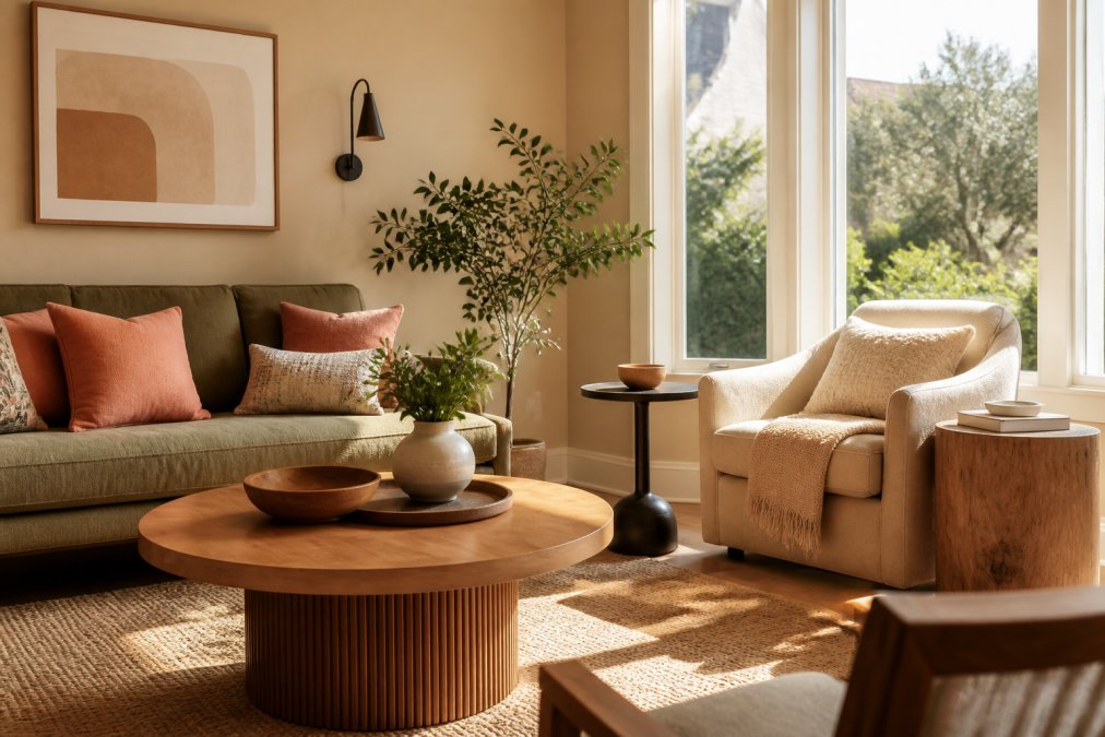
Step 1: Select Your Dominant Color and Neutral Base
Choose a dominant wall color you can live with for years, not a passing trend. Warm, muddy neutrals ground a space and let other colors shine.
Beige, warm gray, greige, or soft taupe work as dominant colors. Choose the right undertone, warm yellow versus cool pink creates entirely different feels.
If not ready to paint, use a large area rug or sofa as your dominant color.
Step 2: Add Secondary and Tertiary Colors
Secondary colors appear in medium-sized elements. Choose colors that work with your dominant, not necessarily colors you love individually.
Tertiary colors (optional) are muted versions of your secondary, pale sage if secondary is forest green. Use in throw blankets, artwork, or books.
Resist adding "just one more color." Too many create visual noise even if muted.
Step 3: Introduce Accent Colors Through Textiles and Decor
Textiles and decor are your playground, changes are temporary and affordable.
Pillows, throws, curtains, artwork, and plants serve as accent vehicles.
Step 4: Balance Visual Weight and Contrast
Visual weight refers to how much a color demands attention. Darker and saturated colors carry more weight; lighter and muted colors recede.
Common Mistakes to Avoid When Mixing Colors
Matching all wood tones. This was the rule for decades. Now it's dated. In 2026, homeowners are moving away from the requirement that all wood finishes must match perfectly. A light oak bookcase next to a dark walnut table next to a medium cherry dresser creates visual interest and feels curated rather than matchy-matchy.
How Lighting Affects Color Perception in Your Space
Lighting transforms color. The same wall color looks warm and inviting under warm incandescent light and cold and sterile under cool fluorescent light. This isn't a flaw in your color choice, it's physics.
Mixing Colors for Small vs. Large Spaces
Small spaces and large spaces require different color strategies. The same approach won't work for both.
| Technique | Best For | Visual Result |
|---|---|---|
| Monochromatic | Creating depth with one hue | Sophisticated, layered, calm |
| Analogous | Harmonious, natural combinations | Cohesive, easy on the eye |
| Complementary | High-impact, energetic spaces | Dynamic, bold, exciting |
| 60-30-10 Rule | Balanced, intentional interiors | Professional, harmonious, restful |
| Mixing wood tones | Curated, collected aesthetic | Interesting, intentional, modern |
Frequently Asked Questions
What is the 60-30-10 rule in interior design?
The 60-30-10 rule is a color balance formula: 60% of your room uses a dominant color (usually a neutral), 30% features a secondary color, and 10% is reserved for accent colors. This approach creates visual harmony while allowing you to mix colors without overwhelming the space. It's one of the most reliable methods for how to mix colors in home interior design because it prevents any single hue from dominating too heavily.
How do I know which colors work well together?
Use the color wheel to identify relationships between colors. Complementary colors (opposite on the wheel) create vibrant contrast, while analogous colors (adjacent on the wheel) produce harmonious combinations. Monochromatic schemes use different tints, shades, and tones of a single color. Start by choosing one approach, then test samples in your actual space under different lighting conditions before committing.
Can I mix different wood tones in one room?
Yes. In 2026, mixing wood tones is a leading design trend. Rather than matching all wood finishes perfectly, homeowners now layer different wood tones to create a curated, natural aesthetic. Use warm, muddy neutrals as a through-line to connect different wood colors throughout the space. This approach works especially well when combined with accent pillows or textiles that tie the palette together, like the multicolor designs available at theJoyincolor.
What should I do if my color scheme feels too bold?
Excessive high contrast can overwhelm a room, so balance bold colors with neutral elements. Use warm, muddy neutrals on walls or large furniture pieces to ground vibrant accent colors. Apply the 60-30-10 rule strictly: keep bold colors to that 10% accent zone. You can also reduce saturation by introducing tints and tones rather than pure, fully saturated hues. Test your palette with smaller decor items before painting walls.