

Table of Contents
- Why Visualizing Colorful Decor Before You Buy Saves Money and Regret
- Step 1: Audit Your Space and Define Your Color Story
- Step 2: Use Digital Home Design Tools for Color Visualization
- Step 3: Learn How to Mix Colors in Home Interior Design Without Clashing
- Step 4: Test Bold Accents in Real Life Before Committing
- Best Color Palettes for Small Apartments in 2026
- Common Mistakes to Avoid When Visualizing Colorful Decor
- Conclusion
- Frequently Asked Questions
Last Updated: September 20, 2026
Why Visualizing Colorful Decor Before You Buy Saves Money and Regret
Learning how to visualize colorful decor in your home before you buy is the single best way to avoid costly returns and color mistakes. A 2025 study from the National Center for Biotechnology Information found that interactive 3D room design tools let people test form and color preferences by moving identical furniture around a virtual space. In plain terms: you can see the result before you spend a dollar.
At theJoyincolor, we hear one question more than any other: "Will this actually match my space?" That worry is fair. Paint looks different under evening light. A pillow that pops online can fall flat on your couch. This guide walks through four steps to preview bold color with confidence, plus the palettes and mistakes that matter most in 2026.
Step 1: Audit Your Space and Define Your Color Story
Start by listing what already lives in the room. Your color story is the small set of hues you commit to before buying anything.
Write down three things:
- Fixed colors: floors, counters, large furniture
- Light direction: which way your windows face
- Existing accents you love and want to keep
That list becomes your filter. Anything new must work with it.
Photograph your room in natural light
Photos expose what your eye skips. Shoot each wall at midday with no lamp on. Then shoot again at night with your usual lighting.
Compare the two sets. Rooms that read warm and cozy at night often look cooler by day. This gap explains most "it looked different online" complaints.
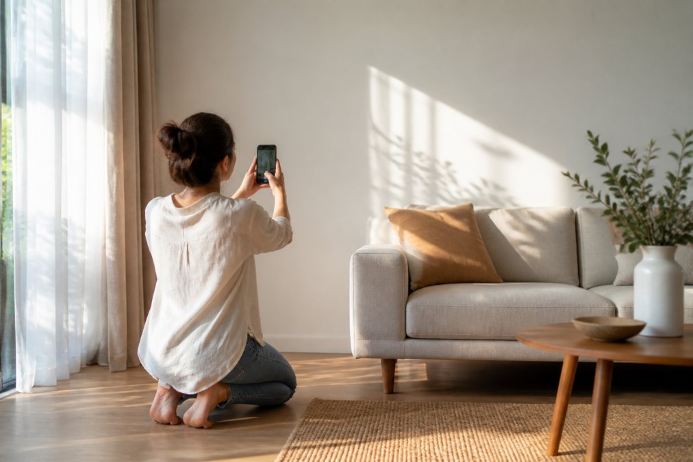
Step 2: Use Digital Home Design Tools for Color Visualization
Digital home design tools for color visualization let you drop real products into a photo of your own room. According to ReimagineHome's 2026 trend report, AI-powered tools are now a leading way for people to gain confidence in design choices before committing to bold layouts.
Here is how to use them well:
- Upload a clear, well-lit photo of your room
- Set the wall color first, then add furniture
- Test two options side by side, never one at a time
- Screenshot your favorites and sit with them for a day
One practical example comes from Lowe's. The retailer built a paint visualizer into its flooring visualizer so shoppers could compare flooring and paint in one view. That single change helped people decide with more confidence.
Step 3: Learn How to Mix Colors in Home Interior Design Without Clashing
Learning how to mix colors in home interior design comes down to ratio, not courage. Pick one dominant hue, one supporting hue, and one small accent.
Three rules keep a room calm:
- Keep the same undertone across your main colors
- Repeat each accent at least twice in the room
- Let one bold piece carry the energy, not five
The 60-30-10 rule in practice
The 60-30-10 rule splits a room into three shares. Sixty percent is your base, thirty percent is your secondary, and ten percent is your accent.
A working example:
- 60%: warm neutral walls and a khaki sofa
- 30%: terracotta curtains and a wood coffee table
- 10%: emerald green pillows and one piece of art
Step 4: Test Bold Accents in Real Life Before Committing
Buy the small version first. A pillow, a hand towel, or a single piece of art costs little and reveals how a color behaves in your actual light.


Live with it for a week. Check it in morning light, evening light, and with your lamps on.
Then decide. If the color still feels right after seven days, it will feel right for years.
Accent pillows are the cheapest test in home design. The Houzz guide to home design trends notes that green has moved from a small accent to a primary hue for 2026, with sage, olive, and forest tones leading demand. A green pillow is a low-risk way to see if that shift fits your room.
Best Color Palettes for Small Apartments in 2026
The best color palettes for small apartments in 2026 lean warm and earthy, not bright white. Color experts report that high-contrast, all-white interiors are giving way to terracotta, khaki, and rich browns.
| Palette | Base (60%) | Secondary (30%) | Accent (10%) | Best For |
|---|---|---|---|---|
| Warm Earth | Khaki walls | Terracotta textiles | Forest green | North-facing rooms |
| Soft Boho | Cream walls | Olive and clay | Turquoise | Rental units |
| Bold Maximal | Warm brown walls | Emerald green | Electric blue | Studios with one focal wall |
Small spaces reward restraint. Two or three hues in the same undertone family make a studio feel larger than a rainbow of accents does.
Zillow's 2026 trend notes point to a rise in personalization, with homeowners adding handmade decor and hand-painted art for unique color. One well-chosen piece beats five generic ones.
Common Mistakes to Avoid When Visualizing Colorful Decor
The biggest mistake is trusting a screen over your own room. Monitors shift color, and product photos are lit for sales, not for your living room.
Watch for these traps:
- Pinning styles that do not match your actual taste or your home's architecture
- Buying a full set of one color before testing a single piece
- Ignoring undertones, so a cool gray and a warm beige fight each other
- Skipping the night-light check, then hating the result after sunset
A common mistake is treating digital previews as final proof. Use them to narrow your options, then confirm with one real object in the room.
Conclusion
Color should feel like a decision you made on purpose, not a gamble you took online. Start with an audit, preview in a design tool, test one small piece, and let the room tell you the rest.
That is where theJoyincolor fits in. Our accent pillows, like the multicolor Mothers Day Accent Pillow at $17.13, come with a machine-washable case and a shape-retaining insert. Our Salt Marsh Hand Towel brings the same color confidence to a bathroom for $13.63. Both are practical, everyday pieces, not display-only decor.
Get started with theJoyincolor and test your next bold color on something small before you commit to something big.
Frequently Asked Questions
How can I use digital tools to visualize colorful decor in my home?
Start by taking clear photos of your room in natural daylight. Upload them to a digital home design tool that lets you swap wall colors and drop in furniture or accent pieces. Lowe's, for example, integrated a paint visualizer into its flooring visualizer so users can compare two flooring choices and paint colors in one interface. Test at least three color combinations before buying anything.
What are the best color palettes for small apartments in 2026?
Green is moving from accent to primary hue in 2026, with sage, olive, forest, and deep green tones in high demand, according to Houzz. Warmer earthier shades like terracotta, khaki, and rich browns are replacing all-white interiors. For small apartments, pair one saturated color with two neutrals and use 60-30-10: 60% dominant neutral, 30% secondary tone, 10% bold accent.
How do I mix colors in home interior design without making a room feel chaotic?
Pick one anchor color and two supporting tones from the same temperature family, then add one contrast accent. Interactive 3D room design research from the National Center for Biotechnology Information (2025) shows users can systematically test form and color preferences by manipulating identical furniture objects in virtual spaces. Try this method: choose your anchor, test it digitally, then introduce the accent last.
What is the best way to test paint colors before committing to a colorful room?
Paint large swatches on poster board and tape them to the wall in different spots. Watch them at morning, afternoon, and evening light. Digital tools can narrow your shortlist first so you only buy one or two sample pots. Pair the paint with an accent pillow or hand towel in the same palette to see how the color behaves against fabric and texture before you commit to a full wall.