

Table of Contents
- Why Vibrant Home Accents Work Better Than You Think
- How to Use the 60-30-10 Rule with Vibrant Home Accents
- Choosing Accent Colors for Neutral Rooms
- Creating Focal Points Without Painting a Single Wall
- Styling Tips for Colorful Throw Pillows and Textiles
- Mixing Textures, Metallic Finishes, and Scale
- Budget-Friendly Vibrant Accents and Keeping Them Looking Fresh
- Conclusion
Last Updated: August 16, 2026
Why Vibrant Home Accents Work Better Than You Think
Most people who avoid bold color in their homes aren't indifferent to it, they're afraid of it. The fear is almost always bigger than the actual risk.
Here's the truth: vibrant home accents are genuinely easier to work with than neutral ones. A single bold vase, saturated throw pillows, or deep-toned ceramic piece does the visual work of three neutral accessories. You need fewer pieces to create impact. The bigger design mistake isn't going too bold, it's playing it so safe that a room has no focal point, no tension, no life.
The Psychology of Bold Color in Living Spaces
Color is a psychological experience, not just a visual one. Warm tones like terracotta, amber, and deep red create warmth and energy that affects how people feel in a room. Cool tones like cobalt, sage, and teal tend to read as calming and expansive. According to color psychology research published by the American Psychological Association, color influences mood, perceived room size, and how long people spend in a space. Designers who understand this use vibrant color deliberately, placing bold accents where they want to draw attention and create emotional resonance.
The fear of vibrant color usually comes from seeing it done badly, too many competing hues with no neutral base to anchor them. The solution isn't less color. It's a better framework.
How to Use the 60-30-10 Rule with Vibrant Home Accents
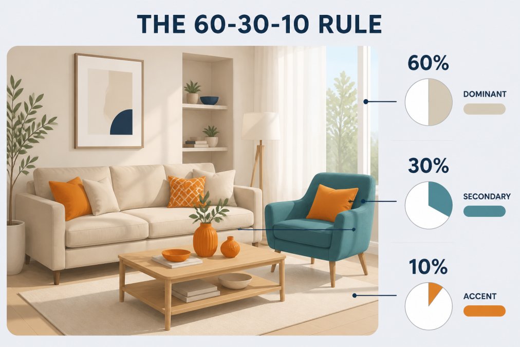
The 60-30-10 rule is the most reliable framework for decorating with vibrant home accents without overwhelming a space. It divides a room's color palette into three proportions: 60% dominant color, 30% secondary color, and 10% accent color.
The 10% is where vibrant home accents live, and that small proportion is exactly what makes them work. A bold hue covering an entire room reads as overwhelming. The same hue on throw pillows, a ceramic bowl, and a lamp shade reads as intentional. Restraint is what gives bold color its power.
Breaking Down the Three Layers
The 60% layer is your room's foundation: walls, large furniture, flooring. This should be a neutral or low-saturation color like warm white, soft greige, light linen, or pale gray. Its job is to stay quiet so everything else can speak.
The 30% layer is your secondary tone, a sofa, rug, curtains, or large furniture piece. It can carry more personality than the 60% layer: a dusty blue sofa, warm terracotta rug, or deep olive armchair. It bridges the neutral base and vibrant accents.
The 10% layer is where you bring in true saturation: throw pillows, decorative objects, statement lamps, or bright candles. These pieces create visual interest and make the room feel curated.
A common mistake is skipping the 30% layer entirely and jumping from neutral straight to vibrant accents. Without that middle tone, bold pieces float without context.
| Layer | Proportion | Examples | Role |
|---|---|---|---|
| Dominant | 60% | Walls, large sofa, flooring | Neutral anchor |
| Secondary | 30% | Rug, curtains, armchair | Bridges base to accent |
| Accent | 10% | Pillows, vases, small decor | Vibrant focal point |
Choosing Accent Colors for Neutral Rooms
Choosing accent colors for neutral rooms is more strategic than it looks. A warm neutral base (cream, ivory, warm white, greige) pulls warm-toned accents forward and can make cool-toned accents feel disconnected. A cool neutral base (pure white, light gray, pale blue-gray) does the opposite.
The practical rule: identify whether your walls and large furniture lean warm or cool, then choose accent colors that harmonize with that temperature or contrast it deliberately. As the Color Association of the United States explains in its design resources, understanding undertones is the single most common gap between professional interior styling and amateur decorating.
Warm Tones vs. Cool Tones: Which to Pick First
Start with the undertone of your largest fixed element, usually flooring or walls, and work outward.
Warm-toned neutral rooms (beige walls, honey wood floors, cream furniture) pair naturally with terracotta, amber, mustard, rust, coral, and warm emerald green. These hues share the same underlying warmth, so they feel cohesive even when saturation jumps.
Cool-toned neutral rooms (gray walls, white oak floors, bright white furniture) work well with cobalt blue, teal, cool sage, lavender, and deep plum. These accents share the cool undertone of the base, creating harmony without monotony.
If you want contrast, use a single contrasting accent color and keep the proportion tight (closer to 5% than 10%).
Creating Focal Points Without Painting a Single Wall
Accent walls get most of the attention, but vibrant home accents create focal points more effectively in many situations because they're three-dimensional, textural, and can be repositioned.
A focal point is simply where your eye lands first. Every well-designed room has one. Here's how to build one without touching a wall:
- Anchor with a large vibrant textile. A bold area rug in a saturated hue immediately establishes the room's visual center.
- Cluster decorative objects in one zone. Three to five pieces in complementary colors, grouped on a shelf or table, create more impact than scattered pieces.
- Use a statement piece of furniture. A single armchair or ottoman in a bold color reads as a focal point against a neutral backdrop.
- Layer lighting with color. A lamp with a vibrant shade or base draws the eye upward and adds warmth to a specific zone.
- Stack art and objects vertically. Large wall art anchors a wall and gives vibrant accessories something to relate to.
The principle is concentration. Vibrant color creates focal points when gathered, not dispersed. Spreading bold accents evenly around a room dilutes their impact.
Styling Tips for Colorful Throw Pillows and Textiles
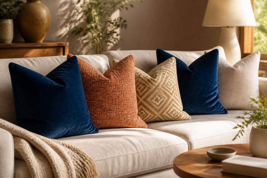
Throw pillows are the most forgiving way to experiment with vibrant home accents, they're affordable, easy to swap out, and immediately transformative. The most effective approach follows a simple formula: vary pattern scale, vary texture, and keep the color palette tight.
- Vary pattern scale. Mix a large geometric print with a smaller solid or subtle texture. Two large-scale patterns compete with each other.
- Vary texture. Velvet, woven cotton, linen, and embroidered fabrics catch light differently, creating visual depth.
- Limit your palette. Two to three colors across all pillows is the sweet spot.
- Use odd numbers. Three or five pillows almost always looks better than two or four.
- Include at least one neutral. A cream, oatmeal, or natural linen pillow gives the eye a place to rest.
The same principles apply to throws, table runners, and curtains. A throw draped over a neutral sofa in a deep, saturated color adds warmth and interest without permanent changes.
Mixing Textures, Metallic Finishes, and Scale
Texture separates a styled room from a decorated one. Two rooms can use the same color palette, but the one with varied textures will always feel richer. According to the American Society of Interior Designers' design principles resources, layering materials with different surface qualities, matte, gloss, woven, smooth, rough, is a core technique professionals use to create cohesive interiors.
Metallic finishes amplify vibrant home accents. A cobalt blue vase next to a brass candleholder looks intentional and elevated. Warm metallics (brass, copper, gold) pair naturally with warm accent colors. Silver and brushed nickel work better with cool tones.
Scale matters significantly. A single large decorative object makes more impact than three small ones. Anchor a shelf display with one piece noticeably larger than the rest, then layer smaller pieces around it. Vary scale by at least 50%, if your largest piece is 30 centimeters tall, your smallest should be no more than 15 centimeters.
Budget-Friendly Vibrant Accents and Keeping Them Looking Fresh
The biggest misconception about decorating with vibrant home accents is that it requires a large budget. The 10% accent layer, by definition, is the smallest investment in a room.
High-impact, low-cost starting points:
- Throw pillows and pillow covers. Swapping covers keeps costs low and makes seasonal updates easy.
- Candles and candle holders. A set of vibrant taper candles adds color for very little cost.
- Ceramic and glass vessels. A single well-made vase or bowl in a saturated color anchors a shelf.
- Textile runners. A bold table runner introduces color without full rug commitment.
- Framed art prints. A single large print with vibrant colors can establish an entire room's accent story.
Keeping vibrant pieces looking fresh extends their life significantly. Saturated colors, especially in textiles, can fade with UV exposure and improper washing:
- Keep vibrant textiles out of direct sunlight or use UV-filtering window film.
- Wash colored textiles in cold water and turn them inside out to preserve dye saturation.
- Dust ceramic and glass accent pieces regularly.
- Rotate accent pieces seasonally to prevent visual fatigue.
For vibrant home accents built to hold their color and stand up to daily life, theJoyincolor offers a curated selection of decorative objects, textiles, and accessories designed with both aesthetic appeal and quality in mind.
Decorating with vibrant home accents doesn't require design expertise, it requires a framework. The 60-30-10 rule, a clear understanding of your room's undertones, and a few well-chosen pieces in varied textures and scales will take most spaces from flat to genuinely compelling. For those who want to skip the trial and error, theJoyincolor's curated collection of vibrant, quality-made home accents gives you a direct path to a more colorful, more intentional space. Browse the collection and find pieces that bring real color to your everyday surroundings.
Frequently Asked Questions
What is the 60-30-10 rule in interior design?
The 60-30-10 rule divides a room's color palette into three parts: 60% goes to a dominant neutral base (walls, large furniture), 30% to a secondary color (rugs, curtains, an armchair), and 10% to accent colors (pillows, vases, art). The 10% is where vibrant home accents live. Keeping bold hues to that smaller share gives them maximum visual impact without overwhelming the space. It's the most reliable framework for mixing color confidently.
How do you balance vibrant colors in a neutral room?
Start with a strong neutral base, white, warm gray, or greige, then introduce one or two saturated hues through accents like throw pillows, a statement vase, or a single piece of wall art. Repeat each accent color at least twice in the room so the eye reads it as intentional rather than random. Metallic finishes (brass, copper) help bridge the gap between bold and neutral by adding warmth without adding more hue competition.
What are the most common decorating mistakes when using bright colors?
The biggest mistake is spreading too many unrelated hues across a room with no cohesive color palette, the result feels chaotic rather than curated. Others include ignoring scale (a tiny pop of color in a large room disappears) and forgetting that lighting changes how saturated a color looks. Fluorescent light flattens warm tones; natural light intensifies them. Always check your accent colors under the actual lighting conditions in your space before committing.
What are the best ways to add bold accents without painting walls?
Textiles do the heaviest lifting: colorful throw pillows, a vibrant area rug, or patterned curtains can shift a room's entire aesthetic without a drop of paint. Wallpaper on a single accent wall, statement lighting fixtures, and decorative objects like geometric vases or bold artwork are equally effective. These options are also reversible, which matters if you rent or change your mind, you can swap one piece and instantly refresh the whole room.
This article was written using GrandRanker