

Table of Contents
-
10 Vibrant Living Room Color Ideas for 2026
- 1. Turquoise with Chartreuse
- 2. Pink Layered with Blue
- 3. Chocolate Brown with Warm Gold
- 4. Forest Green with Terracotta
- 5. Crimson as a Single Accent
- 6. Coral with Beige
- 7. Yellow with Cool Blue
- 8. Botanical Green with Floral Prints
- 9. Jewel Tones on a Dark Base
- 10. Multicolor Through Textiles and Art
- Bold Living Room Color Combinations That Work
- How to Mix Colors in Home Interior Design
- How to Use Bold Colors in a Living Room Without Overwhelming It
- Balancing Bright Colors with Neutral Walls and Furnishings
- Budget-Conscious Ways to Add Vibrant Color
- Conclusion: Finding Your Vibrant Living Room Palette
- Frequently Asked Questions
Last Updated: October 7, 2026
10 Vibrant Living Room Color Ideas for 2026
A vibrant living room is a space where saturated color leads the design, not a beige backdrop with one bright cushion.
Quick Picks:
- Best bold pairing: Turquoise with chartreuse for a high-contrast, energetic room
- Best warm scheme: Chocolate brown with warm gold for a grounded, cozy feel
- Best budget move: Patterned accent pillows on an existing neutral sofa
1. Turquoise with Chartreuse
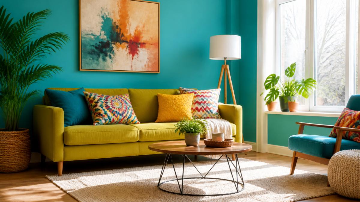
This is the pairing to beat in 2026. LuxeSource's interior design color trend report highlights bright, high-contrast combinations like turquoise with chartreuse as a return to saturated palettes. Use turquoise on the larger surface, a sofa or a painted wall, then bring chartreuse in through a lampshade, a throw, or a single chair.
2. Pink Layered with Blue
Pink and blue is the softer route to a vibrant living room. Keep the blue deep (navy or cobalt) and the pink warm rather than pastel. A blue sofa with pink cushions reads grown-up; pink walls with blue trim reads playful.
3. Chocolate Brown with Warm Gold
Warm browns are central to 2026 living room color coverage, with Atunus Home's living room color trend guide pointing to chocolate brown, espresso, khaki, and tan. Add warm gold in small doses: a brass floor lamp, a gold-framed mirror, a metallic vase. Brown grounds the room; gold keeps it from going flat.
4. Forest Green with Terracotta
Forest green and terracotta are both earthy, so they blend rather than clash. Paint one wall forest green, keep the other three light, and bring terracotta in through ceramics, a rug, or cushions. It is the easiest bold combination to live with long term.
5. Crimson as a Single Accent
Crimson is intense, so treat it as a punctuation mark. One crimson armchair against neutral walls changes the mood of a room; two crimson pieces starts to feel heavy. Choose a crimson with some depth rather than a pure red.
6. Coral with Beige
Coral softens a beige room without fighting it, the combination to reach for if you like neutral walls but want more life. Coral works especially well on textiles: curtains, a throw, an accent pillow. Beige stays the base; coral does the talking.

7. Yellow with Cool Blue
Yellow and blue sit opposite each other on the color wheel, which is why the pairing works. A warm yellow wall with cool blue furnishings feels bright without feeling chaotic. Keep yellow on one surface only, and let blue carry the furniture.
8. Botanical Green with Floral Prints
Botanical and floral prints bring green into a room without a single can of paint, patterned walls, printed curtains, floral wallpaper. If you already have a green sofa, floral textiles in a lighter green tie the room together. If your walls are neutral, a floral print is the fastest way to add vibrancy.
9. Jewel Tones on a Dark Base
Rich jewel tones, sapphire, emerald, amethyst, look their best against a dark base. A deep wall color makes jewel-toned upholstery read as intentional rather than random. This scheme suits evening rooms and low-light spaces. Add one metallic element to keep the darkness from closing in.
10. Multicolor Through Textiles and Art
If committing to one palette feels risky, multicolor textiles and abstract art do the job instead. A multicolor accent pillow or bold abstract print adds several colors at once, so the room feels vibrant without a repaint, and it is the easiest idea to reverse.
| Idea | Lead Color | Supporting Color | Best For |
|---|---|---|---|
| 1 | Turquoise | Chartreuse | High-energy, high-contrast rooms |
| 2 | Deep blue | Warm pink | Soft but saturated schemes |
| 3 | Chocolate brown | Warm gold | Cozy, grounded living rooms |
| 4 | Forest green | Terracotta | Rooms with wood floors |
| 5 | Crimson | Neutral walls | One-statement-piece rooms |
| 6 | Coral | Beige | Neutral walls that need life |
| 7 | Yellow | Cool blue | Bright, balanced rooms |
| 8 | Botanical green | Floral prints | Renters and print lovers |
| 9 | Jewel tones | Dark walls | Evening and low-light rooms |
| 10 | Multicolor | Existing neutrals | Low-commitment color |
Bold Living Room Color Combinations That Work
Bold living room color combinations work when one color leads and the rest support it. The mistake most people make is treating every color as equal.
A simpler rule: pick one saturated color, one secondary color, and one neutral. Turquoise leads, chartreuse supports, warm white holds the room together.
Contrast matters more than the specific hues. A saturated color against a light wall reads bolder than the same color against a mid-tone. If you want a stronger effect without repainting, lighten what sits next to the color instead.
How to Mix Colors in Home Interior Design
Mixing colors in home interior design comes down to proportion, undertone, and testing, not permission. There is no rule about which colors may sit together, only about how much of each you use and whether their undertones agree.
Start with proportion
A workable split is roughly 60% dominant, 30% secondary, and 10% accent. In a vibrant living room, the dominant color is often still a neutral wall, with the saturated color taking the 30% role through a sofa or rug. The 10% is where you can be fearless.
Then check undertones
Two colors can look identical on a paint chip and clash on a wall because their undertones pull in opposite directions. Warm undertones (red, orange, yellow) and cool undertones (blue, green, violet) fight at the same value: a warm coral next to a cool gray-blue reads muddy, while the same coral next to a warm cream reads intentional.
Name the shades so you can recreate them
Vague color names are why most palettes fail to reproduce. When you shop, write down the brand, color name, and sheen. Reference points that map to this guide:
- Turquoise with chartreuse: a saturated teal-leaning turquoise as the lead, a yellow-green chartreuse as the accent. Keep the chartreuse to textiles so it does not overwhelm a wall.
- Deep blue with warm pink: a navy or cobalt with a warm, slightly dusty pink rather than a cool baby pink.
- Chocolate brown with warm gold: an espresso or chocolate brown base, with gold introduced through metal and textile rather than paint.
Three methods, and when each works
- Analogous: choose colors next to each other on the color wheel, like forest green and turquoise. These always look calm together and are the safest route to a vibrant room.
- Complementary: choose colors opposite each other, like yellow and blue. These look energetic and need careful proportion, keep one color to roughly a quarter of the other.
- Neutral plus one: keep everything neutral except a single saturated color. This is the safest route and the easiest to adjust later.
Test in the actual room, in the actual light
A repeatable process beats a swatch every time:
- Paint two coats on a large piece of poster board, not a tiny chip.
- Move the board to the wall you intend to paint and leave it for a full day.
- Look at it in morning light, mid-afternoon light, and after dark with your lamps on.
- Compare it against your fixed finishes, floor, trim, countertops, and furniture you are keeping.
- Only then buy paint.
Contrast matters more than the specific hues. A saturated color against a light wall reads bolder than the same color against a mid-tone. If you want a stronger effect without repainting, lighten what sits next to the color instead.
How to Use Bold Colors in a Living Room Without Overwhelming It
Using bold colors in a living room without overwhelming it means controlling how much of the room each color covers.
Start with the largest surface you are willing to change.
Then reduce the competition. If the sofa is crimson, keep the walls light and the floor neutral.
Light matters too.
Balancing Bright Colors with Neutral Walls and Furnishings
Balancing bright colors with neutral walls and furnishings is how most people get a vibrant living room without repainting everything. Neutral walls are not a compromise, they are the frame. How much neutral you need depends on the room, not a fixed rule.
Read the room before you choose the balance
Four conditions change how a vibrant color behaves:
- Natural light: A room with strong daylight can carry a saturated wall or large sofa; a dim room cannot, the same color reads heavy and closes the space in. In low-light rooms, keep the bold color on smaller objects and let light walls bounce what light there is.
- Room size: In a small room, a single saturated surface, one wall, one rug, one sofa, reads as a deliberate focal point, while covering every surface makes it feel smaller. In a large room, you can spread the color across more surfaces.
- Ceiling height: Low ceilings benefit from keeping the bold color low, on the floor, a rug, or a sofa, and the ceiling light. High ceilings can take a saturated wall without feeling top-heavy.
The practical version
Keep walls, floors, and large furniture neutral, then layer bright color through textiles and decor.
This approach also solves the durability problem. Neutral walls and flooring hold up to daily life and trend changes. Bright textiles are the part you replace when your taste moves, and they cost far less than repainting or reupholstering.
Durability and household suitability
Vibrant color in a living room has to survive real life:
- High-traffic rooms: Saturated paint in a flat finish shows scuffs. A washable or scrubbable satin or eggshell sheen holds up better on walls that get touched.
- Pets and children: Textiles take more abuse than walls. A machine-washable pillow cover or washable rug lets you keep a bold color without treating it as fragile.
- Fading: Strong sunlight fades saturated textiles, especially curtains and upholstery near a window. Rotating cushions and throws spreads the wear.
Our Mothers Day Accent Pillow is built for exactly this role. It is a machine-washable polyester case with a hidden zipper and a shape-retaining insert, so it holds its shape through everyday use. At $17.13, it is a low-risk way to test a bold color in your actual room before committing to anything larger.

Budget-Conscious Ways to Add Vibrant Color
The cheapest way to add vibrant color is to change the smallest movable objects first. Paint is affordable but permanent and time-consuming; textiles are neither.
Start with these:
- Accent pillows: the lowest-cost way to introduce a new color, and easy to rotate
- Throws and blankets: add color and texture at the same time
- Curtains: a large surface that delivers big visual change for modest cost
Layering color through decor also lets you test a palette before you commit. Live with a coral pillow for a month; if it still works, buy the coral curtains.
Our Boho Accent Pillow and Darkness to Light Accent Pillow follow the same construction as our other accent pillows: 100% polyester case and insert, machine-washable case, hidden zipper, and a shape-retaining insert included.

Conclusion: Finding Your Vibrant Living Room Palette
The hardest part of a vibrant living room is not choosing a color, it is committing to one and building the room around it.
Pick one idea from the ten above. Test it with a pillow or a throw before you paint anything.
That is how we approach color at theJoyincolor.
Frequently Asked Questions
What are the color trends for living rooms in 2026?
2026 living room color trends lean toward grounded warmth and refreshing contrasts. BEHR's 2026 palette balances warm browns and khakis with cool accents, while HGTV Home by Sherwin-Williams highlights shades like Cordovan, Lemon Chiffon, and Still Water. High-contrast pairings such as turquoise with chartreuse and pink layered with blue are also being highlighted by designers for a vibrant living room look.
How can I add a bold color to my living room without overwhelming it?
Start with a single accent wall or one large piece of colorful upholstery, then keep the rest of the room neutral. Use the 60-30-10 rule: 60% neutral base, 30% secondary color, and 10% bold accent. For a low-commitment option, try a machine-washable accent pillow like the Boho Accent Pillow from theJoyincolor ($17.13) to test a bold hue before painting.
Which colors work well together in a vibrant living room?
Color pairings that work well include turquoise with chartreuse, pink with blue, and warm terracotta with forest green. For a balanced scheme, pair one warm color with one cool color and anchor them with a neutral like beige or khaki. Mixing colors in home interior design is easier when you repeat each hue at least twice in the room through textiles, art, or furniture.
How do I choose a living room color scheme for my furniture and lighting?
Start with your largest fixed piece, such as a sofa or rug, and pull two or three colors from it. If your lighting is warm, warm colors like coral, crimson, and warm gold will feel richer; cool lighting suits blues, greens, and turquoise. Test paint samples on all four walls and check them at morning, afternoon, and evening to see how the light shifts the color.