

Table of Contents
- Why Beige Is Falling Out of Favor in Modern Homes
- Warm Neutral Paint Colors for Modern Homes
- How to Mix Colors in Home Interior Design Without Overwhelm
- Best Accent Colors for Modern Living Rooms
- How Lighting Changes Every Alternative to Beige
- Testing Samples Before You Commit
- Frequently Asked Questions
Last Updated: September 25, 2026
Why Beige Is Falling Out of Favor in Modern Homes
Beige built its reputation as the safe choice, but safe has quietly become the problem. According to Zillow's 2026 analysis of paint colors that help sell a house for more money, warm chocolate brown tones, specifically a shade called Turkish Coffee, are now top performers for attracting buyers and higher offers. At theJoyincolor, we watch the same shift play out in what people actually buy: muted walls set the stage, then color does the talking.
Warm Neutral Paint Colors for Modern Homes
The strongest warm neutral paint colors for modern homes are greige, taupe, and warm off-whites. These shades hold the calm of beige but add gray or brown depth, so walls feel intentional rather than default.
Greige and Taupe: The New Middle Ground
Greige blends gray with beige to create a more balanced, modern neutral than traditional beige, according to Pamela Lynn Interiors' 2026 trend notes. Taupe pushes further toward grayish-brown and makes a stronger design statement while staying neutral. Both work across living rooms, hallways, and open-plan spaces because they shift with the light instead of fighting it.
Off-Whites That Replace Standard Beige
Popular off-whites like Shoji White, White Duck, and Ballet White are replacing standard beige for whole-home palettes, per Kylie M Interiors' 2026 paint color trend update. These warm whites feel brighter than beige without tipping into sterile white. Use them on trim, ceilings, and full rooms where you want light to bounce.
| Neutral | Base Tone | Best Room | Why It Beats Beige |
|---|---|---|---|
| Greige | Gray + beige | Living room | Balances warm and cool light |
| Taupe | Grayish-brown | Bedroom | Adds depth without weight |
| Warm off-white | Soft cream | Whole home | Brighter, less yellow |
| Mushroom | Earthy gray | Kitchen | Grounds natural finishes |
How to Mix Colors in Home Interior Design Without Overwhelm
Learning how to mix colors in home interior design starts with one rule: pick a dominant neutral, then layer accents in controlled amounts. Most rooms fail because every element competes at the same volume.
The 60-30-10 Rule in Practice
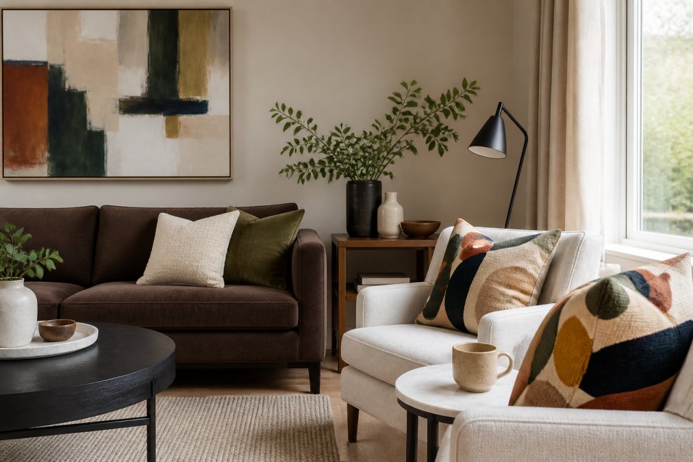
Split your palette into three parts. Sixty percent is your dominant neutral, the walls and large furniture. Thirty percent is a secondary tone, like taupe upholstery or an off-white rug. Ten percent is the accent, the color that carries personality. A chocolate brown sofa with two multicolor abstract pillows hits that 10 percent without overwhelming the room.
Best Accent Colors for Modern Living Rooms
The best accent colors for modern living rooms come from earth, not neon. Earthy browns, muted sages, and soft ochres add warmth and depth against greige or off-white walls, and they pair with almost any existing furniture.
Earthy Browns and Chocolate Tones
HGTV Home by Sherwin-Williams features earthy shades like Griffin, Cordovan, and Universal Khaki in its 2026 Color Collection of the Year, designed to complement natural wood and stone finishes. Chocolate browns work as accent walls, upholstery, or throw pillows. They add weight to a room without making it feel dark.
Muted Sages and Soft Ochres
Sage and ochre bring a subtle color temperature shift that keeps a neutral room from going flat. Sage leans cool and pairs well with warm woods. Ochre leans warm and lifts gray-toned walls. Use either in textiles first, since pillows and throws are the cheapest way to test an accent before committing to paint.
How Lighting Changes Every Alternative to Beige
No paint color looks the same in every room, and there is no single no-fail neutral, according to Kylie M Interiors' 2026 guidance on testing neutrals. Lighting, both natural and artificial, changes how undertones read, and the reason is measurable, not mystical.
The Mechanism: Color Temperature and Undertone Collision
Every light source has a correlated color temperature (CCT) measured in kelvin. The higher the kelvin, the cooler and bluer the light. The lower the kelvin, the warmer and more amber it becomes. When the CCT of your bulbs fights the undertone of your paint, the wall looks muddy, green, or pink, even if the swatch looked perfect in the store.
- 2700K (warm white): the standard for most residential lamps and recessed cans. It amplifies yellow and red undertones, which is why beige turns orange or peachy under evening light.
- 3000K (soft white): slightly cooler, common in kitchens and bathrooms. It flattens warm neutrals and can make greige read more gray.
- 3500K-4000K (cool white): common in garages, utility rooms, and some newer builds. It pulls warm neutrals toward green or gray and makes cool neutrals look cleaner.
- 5000K+ (daylight): rare in living spaces but common in offices. It makes warm neutrals look dingy and cool neutrals look crisp.
Directional Light: What Each Exposure Does to a Neutral
- North-facing rooms receive indirect, cool-toned daylight all day. Cool light suppresses warm undertones, so warm neutrals like greige, taupe, and warm off-white hold their color better here. Cool grays can turn blue or icy.
- South-facing rooms flood with warm, direct light. Warm light amplifies yellow and red, so a yellow-based beige pushes toward orange and a warm off-white can read cream. Cool neutrals like gray-green or gray-blue balance this exposure.
- East-facing rooms get cool morning light that warms by midday. Neutrals here shift twice a day, so test at both ends.
- West-facing rooms get warm afternoon light that intensifies toward sunset. Warm neutrals can glow; cool neutrals can go flat.
The Psychology Angle Competitors Skip
Light does not just change color, it changes mood, and the neutral you choose amplifies that. Cool-toned neutrals (gray-leaning greige, gray-green, gray-blue) tend to read as calm, focused, and slightly more formal, which suits home offices and bedrooms. Warm-toned neutrals (taupe, mushroom, warm off-white) tend to read as cozy, grounded, and inviting, which suits living rooms and dining spaces.
A Practical Light Audit Before You Buy
- Note the compass direction of the room's main windows.
- Check the kelvin rating printed on your existing bulbs, most are on the base or the packaging.
- Count how many hours of direct sun the room gets in winter versus summer.
- Test your top two neutral candidates side by side on the same wall, not in separate rooms.
Do this once and you will stop guessing why a color that looked perfect in the store looks wrong at home.
Testing Samples Before You Commit
Sample testing is the step most buyers skip, and it is the one that prevents expensive mistakes. But testing in isolation is not enough, a neutral has to work with what is already in the room, not just with itself. This is the gap most guides miss: they tell you to test the paint, not to test the paint against your floors, cabinets, and furniture.
Step 1: Read the Undertones Already in Your Room
Before you buy a single sample, identify the undertones you are matching against.
- Wood flooring and furniture: Look at the wood in daylight, not under lamps. Red oak and cherry pull red-orange. White oak and maple pull yellow or neutral. Walnut and espresso pull red-brown or violet. A greige with a green undertone will fight red oak; a taupe with a violet undertone will harmonize with it.
- Carpet and rugs: Most wall-to-wall carpet is a warm gray or a cool gray. Warm gray carpet pairs with greige and taupe; cool gray carpet pairs with gray-green and gray-blue.
- Stone and tile: Granite and quartz often carry a hidden pink, green, or blue fleck. Hold a paint chip directly against the countertop edge in daylight to see which undertone the stone is actually pulling.
- Existing upholstery: A chocolate brown sofa reads warm; a charcoal sofa reads cool. Your wall neutral should share a temperature family with the largest piece of furniture in the room.
Step 2: Test in the Right Conditions
Paint a large swatch, at least two feet square, directly on the wall or on a movable board. Check it in morning light, afternoon light, and under your lamps at night. Move the board to a second wall in the same room, light bounces differently off adjacent surfaces. Compare the swatch against your flooring, cabinets, and existing furniture at each check.
Step 3: Test the Accent Cheaper Than the Paint
For accents, test the same way but cheaper. A $17.13 Boho Accent Pillow or a Mothers Day Accent Pillow lets you see how a color behaves in your actual light before you commit to paint or upholstery. The machine-washable case and shape-retaining insert make them easy to live with while you decide. Layer in a Salt Marsh Hand towel or a Joy Mug with Color Inside to carry the same accent through the kitchen or bath, so the color story holds together room to room.


Step 4: Choose Low-VOC and Non-Toxic Options
Modern homeowners increasingly prioritize indoor air quality, and the sample phase is the right time to decide on formulation. Look for paints labeled low-VOC or zero-VOC, and check whether the colorant itself is low-VOC, many base paints are low-VOC but the tint added at the counter is not. Water-based formulas generally off-gas faster than oil-based ones, which matters if you are painting a bedroom or a child's room.
Frequently Asked Questions
What is the 3-5-7 rule in interior design?
The 3-5-7 rule is a guideline for arranging accessories and patterns. It suggests grouping items in odd numbers, like three, five, or seven, to create visual balance. For example, three accent pillows on a sofa, five books on a shelf, or seven decorative objects on a mantel. Odd numbers feel more natural and less rigid than even ones, helping a room look collected rather than perfectly matched.
What color is replacing gray in 2026?
Warm neutrals like greige and taupe are replacing cool gray in 2026. Greige blends gray with beige for a balanced, modern neutral, while taupe offers a refined grayish-brown. Zillow's 2026 research also found that warm chocolate browns, such as Turkish Coffee, are top-performing colors for attracting buyers and potentially securing higher offers. These shades add warmth without the yellow cast of traditional beige.
How do I transition from a neutral beige home to a colorful aesthetic?
Start by swapping small accents rather than repainting everything. Add multicolor accent pillows or a vibrant hand towel to introduce color without commitment. Then layer in one or two warm neutrals like greige or taupe on larger surfaces. Use the 60-30-10 rule: 60% dominant neutral, 30% secondary tone, and 10% bold accent. This gradual approach lets you test how colors work with your existing furniture and lighting.
Which paint colors make a modern home feel warm but not beige?
Warm off-whites like Shoji White, White Duck, and Ballet White replace standard beige for whole-home palettes. Greige and taupe provide a balanced middle ground, while earthy shades such as Griffin, Cordovan, and Universal Khaki from HGTV Home by Sherwin-Williams' 2026 Color Collection add depth. Natural Linen is another favorite for a quietly elevated neutral that avoids the boring perception of beige.
What two colors look good together for a house?
Greige and warm white work well as a base pairing for walls and trim. For accent combinations, pair muted sage with soft ochre, or chocolate brown with off-white. These combinations create contrast without clashing. Test samples in your actual lighting, because undertones shift throughout the day. A color that looks balanced in morning light may read cooler or warmer by evening.
Moving past beige is less about chasing a trend and more about choosing neutrals with real undertone and depth. theJoyincolor makes that shift easy with color-forward pieces that let you test an accent before you commit to a full repaint. Start with an accent pillow, a hand towel, or a mug, and see how the color lives in your light. Get started with theJoyincolor and build a home palette that feels intentional, not default.