

Table of Contents
- 1. Grounded Color Palettes: The 2026 Colorful Home Office Baseline
- 2. Productivity-Boosting Office Colors: How to Mix Colors in Home Interior Design
- 3. Accent Walls and Wall Treatments That Add Color Without a Repaint
- 4. Productivity-Boosting Office Colors, Task by Task
- 5. Small Home Office Organization Tips for Bold, Clutter-Free Color
- 6. Budget-Friendly DIY Color Transformations Under $50
- 7. Color for Every Brain: Neurodivergent-Friendly and Camera-Ready Offices
- Conclusion: Start With One Color, Not the Whole Room
- Frequently Asked Questions
Last Updated: October 3, 2026
1. Grounded Color Palettes: The 2026 Colorful Home Office Baseline
The colorful home office has moved away from stark white walls and neon pops. In 2026, the strongest looks start with grounded, warm color palettes. Designers are favoring earthy neutrals, rich greens, and muted blues to shape the workspace environment, according to Govee's 2026 home office trend analysis. This is the new baseline for anyone searching for colorful home office decor ideas 2026.
Why does this matter for your space? A colorful home office built on warm neutrals gives you a foundation that stays calm while your accents do the talking. At theJoyincolor, we see this play out constantly: people buy one bold piece, then realize they need a quieter backdrop to make it sing. Start with the backdrop, not the pop.
Why Muted Blues and Rich Greens Beat Stark White
Stark white reflects light but offers no warmth. Muted blues and rich greens do something different: they lower visual noise while still reading as color. Decorilla's 2026 home office trend report identifies colorful schemes as a primary design pillar for the year, alongside wellness zones and sustainable craftsmanship. That pairing is not accidental. Calmer color makes a workspace feel less clinical and more like somewhere you want to sit for eight hours.
2. Productivity-Boosting Office Colors: How to Mix Colors in Home Interior Design
Learning how to mix colors in home interior design starts with a simple ratio, not a color wheel. The most reliable method is the 60-30-10 split: 60% dominant color, 30% secondary, 10% accent. Most people invert it, buying accent pieces first and then wondering why the room feels chaotic.
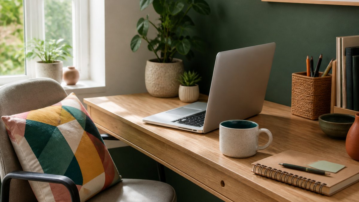
The 60-30-10 Split, Translated for a Desk Setup
Here is how the ratio looks in practice for a productivity-boosting office color scheme:
- 60% dominant: Wall color or the largest furniture piece. Choose a muted blue, rich green, or warm earthy neutral.
- 30% secondary: Desk, shelving, or a rug. Warm wood textures work well here.
- 10% accent: The colorful home office details. A multicolor accent pillow, a mug with a colored interior, one piece of wall art.
The 10% is where most rooms fail. People treat accents as the whole scheme instead of the finishing layer.
3. Accent Walls and Wall Treatments That Add Color Without a Repaint
An accent wall is the fastest way to add color to a home office without repainting the entire room. You paint or cover one wall, leave the rest neutral, and the room reads as colorful without becoming overwhelming.
The catch: choose the wall behind your desk, not the one you face. A saturated color in your direct line of sight competes with your screen all day. Behind you, it becomes a backdrop.
For renters or the commitment-averse, wall treatments do the same job. Peel-and-stick panels, a large canvas, or a fabric hanging all deliver color with zero paint. This is where a custom canvas or a bold printed pillow propped against the wall can stand in for a full repaint.
| Approach | Effort | Reversible | Best For |
|---|---|---|---|
| Paint one wall | Medium | No | Permanent setups, renters with permission |
| Peel-and-stick panels | Low | Yes | Rentals, frequent movers |
| Large canvas or art | Low | Yes | Anyone who wants color without commitment |
| Fabric hanging | Low | Yes | Textured, soft color |
4. Productivity-Boosting Office Colors, Task by Task
Color affects focus differently depending on the work. The right productivity-boosting office colors for deep focus are not the same ones that work for creative brainstorming.
- Deep focus and analysis: Muted blues and greens. Lower stimulation, fewer distractions.
- Creative work: Warm accents, yellows, and oranges in small doses. Higher visual stimulation.
- Video calls: A mid-tone background. Bright white blows out on camera; very dark walls swallow you.
- Admin and email: Neutral base with one small accent. Low cognitive load.
The practical move is task-specific design: if your desk serves one main purpose, match the color to that purpose. If it serves three, keep the base neutral and rotate accents.
5. Small Home Office Organization Tips for Bold, Clutter-Free Color
Small home office organization tips matter more in a colorful room, because clutter and color compete for the same attention. A bold palette needs visual breathing room to work.
The fix is color-coded organization. Group your supplies, cables, and papers by function and assign each group a color. Bins, folders, and trays in matching tones do two jobs at once: they organize and they reinforce the scheme.
- Use one accent color for everything you reach for daily.
- Keep a second color for storage you open weekly.
- Leave everything else neutral so the color reads as intentional.
Office Principles' 2026 workplace design trends notes that biophilic design, the connection between nature and workspace, is a leading office trend for the year. In a small room, that can be as simple as one plant in a colorful pot. It adds a living accent and softens hard edges.
6. Budget-Friendly DIY Color Transformations Under $50
You do not need a renovation budget to shift a room's color story. Small, high-impact swaps do most of the work, and they are reversible if a color does not land.
Our picks from theJoyincolor, all under $20:
- Mothers Day Accent Pillow ($17.13): a multicolor abstract accent that brings a whole corner to life. Machine-washable case, shape-retaining insert included.
- Boho Accent Pillow ($17.13): same build, softer boho print for a calmer palette.
- Joy Mug with Color Inside ($15.63): a ceramic mug with a colored rim, handle, and interior. It sits on your desk all day as a small color anchor.
- Boho Flowers Black Glossy Mug ($10.50): lead and BPA-free ceramic, dishwasher and microwave safe.
A pillow on your chair and a mug on your desk cost less than a tank of gas and change how the room reads.


7. Color for Every Brain: Neurodivergent-Friendly and Camera-Ready Offices
Two groups get left out of most color guides: neurodivergent workers and anyone who spends the day on video calls. Both have specific color needs, and both are easy to design for.
For neurodivergent-friendly office design, the priority is reducing visual noise. That means a low-stimulation base, one accent color rather than five, and a clear visual boundary between work zones. Too many competing colors make it harder to settle into a task.
For camera-ready offices, the rule is simple: your background should frame you, not fight you. A mid-tone wall, one or two colorful objects, and soft ambient lighting beat a busy shelf every time. Position your desk so a window is to your side, not behind you.
Conclusion: Start With One Color, Not the Whole Room
The biggest mistake in colorful home office decor is trying to solve the whole room at once. Pick one grounded base, one accent, and one small colorful object you actually use every day. Then live with it for a week before adding anything else.
That is how we approach it at theJoyincolor. Our collection is built for exactly this: small, quality pieces that add vibrancy without demanding a renovation. Start with a multicolor accent pillow, a mug with a colored interior, or one bold canvas, and build from there.
Get started with theJoyincolor and bring one honest splash of color to your workspace this week.
Frequently Asked Questions
What are the top home office decor trends for 2026?
Three directions lead 2026 reporting: grounded, warm palettes built from earthy neutrals, rich greens and muted blues; colorful schemes treated as a primary design pillar rather than an accent; and wellness-focused layouts with biophilic elements. Designers are also adding meaningful objects, framed art, textiles and small ceramics, to bring color in without repainting. The practical takeaway is that color now carries the personality of the room, while the desk and lighting stay functional.
How does colorful decor impact work productivity?
Color sets the tone of a workspace before you sit down. Cool tones such as muted blues and greens tend to read as calm and steady, which suits focused, long-form work. Warmer saturated tones add energy and are better placed where you want quick, creative bursts, such as a brainstorming corner or a whiteboard wall. The useful move is matching the color to the task performed in that spot, rather than painting the whole room one loud shade.
How can I incorporate bold colors into a small home office?
Keep the walls neutral and let small, swappable pieces carry the color. A multicolor accent pillow on the desk chair, a mug with a colored rim and interior, or one framed print adds saturation without shrinking the room. Because these items are rearrangeable, you can rotate them seasonally. Start with one bold piece, live with it for a week, then add a second in a related tone so the palette reads as intentional.
What are the best color palettes for a modern home office in 2026?
Two combinations cover most setups. First, a grounded palette: sage or forest green, warm wood textures and cream, with one muted blue accent. Second, a warm neutral base of clay, sand and soft gray with a single saturated accent such as red or golden yellow. Both work in a contemporary office because the base stays quiet and the accent does the talking. Add greenery or a nature print to complete the biophilic element.
What is the 3-5-7 rule in decorating?
The 3-5-7 rule is a styling guideline for arranging accessories: group items in odd numbers, usually three, five or seven, and vary their heights so the eye moves across the surface. Applied to a colorful home office, that might mean three items on the desk, five on a shelf and seven smaller pieces across a wall display. The odd count and height variation stop a colorful shelf from looking cluttered or symmetrical in a flat, catalog-style way.