

Table of Contents
- How to Mix Bold Patterns in Interior Design Without Overwhelm
- Mixing Patterns by Scale: The Foundation of Balance
- How to Mix Patterns Without Clashing: Color as Your Anchor
- Pattern Mixing Rules for Decorating: What to Break and What to Keep
- Interior Design Pattern Combinations That Work in Real Rooms
- Step-by-Step: Your Pattern Selection Process
- Conclusion
- Frequently Asked Questions
Last Updated: October 12, 2026
How to Mix Bold Patterns in Interior Design Without Overwhelm
Learning how to mix bold patterns in interior design comes down to one idea: contrast needs a referee.
Here is the good news. You do not need a design degree, a big budget, or a perfect eye. You need three decisions: pick a hero, vary the scale, and anchor the color.
Below, we show you exactly how to do all three, plus the mistakes that make rooms feel chaotic instead of collected.
Start With One Hero Pattern
Every bold room starts with a single star. Choose one print you love most, then let it set the tone for everything else.
Pick it first because it is the hardest decision. A large floral, a graphic geometric, or a painterly abstract all work.
Then build around it:
- Pull two or three colors out of the hero print
- Repeat those colors in the supporting patterns
- Keep the hero the biggest or boldest element in the room
A common mistake is treating every pattern as equal. When five prints compete at the same volume, the eye has nowhere to rest.
Mixing Patterns by Scale: The Foundation of Balance
Mixing patterns by scale is the fastest way to make bold prints look intentional. Scale is simply how big the shapes are inside a print. When every pattern is the same size, the room reads as flat and busy at once.
Large, Medium, and Small: The Three-Tier Rule
The three-tier rule says a room needs one large-scale pattern, one medium-scale pattern, and one small-scale pattern. That range creates contrast and visual interest without chaos.
Think of it like music. The large pattern is the bass line. The medium pattern carries the melody. The small pattern adds the high notes.
| Pattern Tier | Example Print | Where It Works Best |
|---|---|---|
| Large scale | Oversized floral, wide geometric | Upholstery, area rug, wallpaper |
| Medium scale | Stripes, medium botanical | Curtains, accent chair, pillows |
| Small scale | Dots, tight checks, mini motifs | Trim, small pillows, table linens |
How to Mix Patterns Without Clashing: Color as Your Anchor
Learning how to mix patterns without clashing is mostly a color problem, not a pattern problem. Two busy prints rarely fight over their shapes. They fight over their colors. A unifying color fixes that fast.
Building a Unifying Color Palette
A unifying color palette is a short list of two or three colors that appear in every pattern you use.
Here is how to build one:
- Pull the first color from your hero pattern
- Choose a second color that appears in at least two prints
- Add one neutral, such as cream, camel, or charcoal, as a base
Complementary colors can work too, but use them with care. A bold blue and a warm orange will pop hard against each other.
Tone-on-tone prints are your quiet allies. A cream-on-cream stripe or a soft botanical adds texture without adding another loud color.
Pattern Mixing Rules for Decorating: What to Break and What to Keep
Pattern mixing rules for decorating are useful, but only up to a point. Keep the ones that protect balance. Break the ones that only exist to make rooms look safe.
Rules worth keeping:
- Vary the scale across every pattern in the room
- Repeat at least one color in each print
- Give the eye a solid or tone-on-tone break between bold pairings
Rules worth breaking:
- "Never mix stripes with florals." Stripes and florals pair beautifully when the scales differ.
- "Stick to one pattern family." Mixing geometric with organic patterns is what makes a room feel collected.
- "Match your metals and your prints." Harmony comes from color, not from matching sets.
Common Mistakes and How to Fix Them
The most common mistake is too many patterns at one scale. The fix is simple: swap one print for a solid or a larger-scale option.
Other frequent slips and their fixes:
- Clashing colors: find one shared color and rebuild around it
- No focal point: give the hero pattern more space or a bigger role
- All-over busyness: add a solid upholstery piece as a visual break
Interior Design Pattern Combinations That Work in Real Rooms
The best interior design pattern combinations are the ones that already exist in real homes, not in styled catalogs.
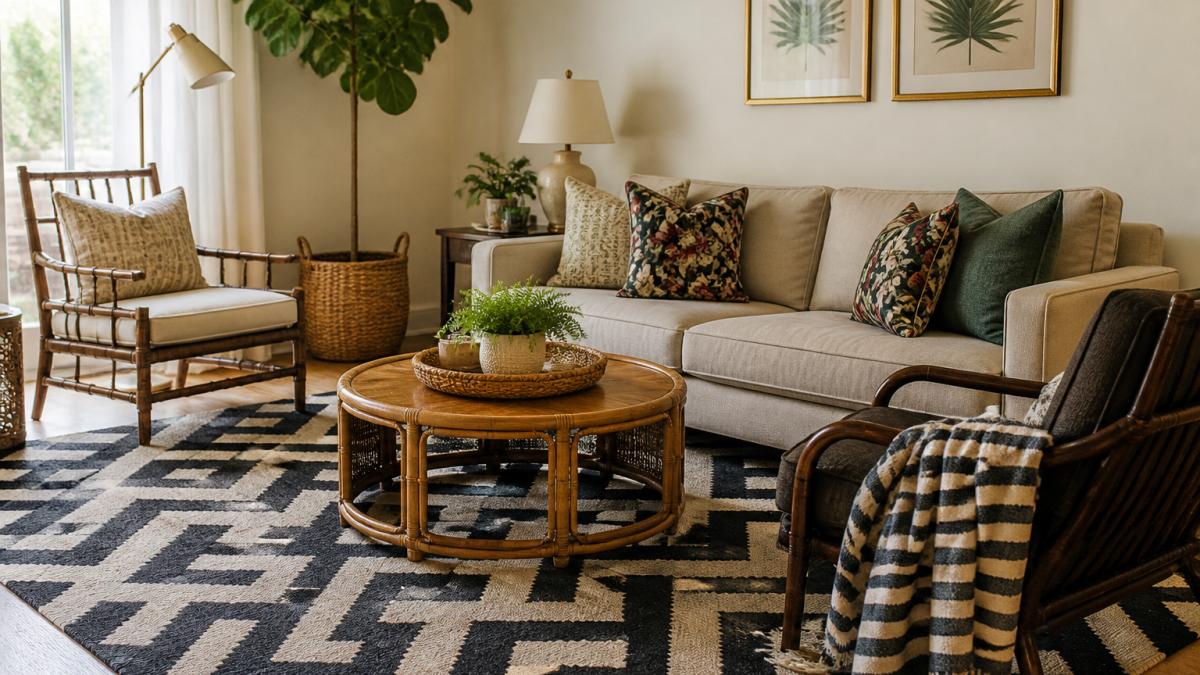
Living Room: Anchor Low, Accent High
A living room has the most surface area to work with, so it can carry the widest scale range. The reliable formula:
- Large scale on the floor. An oversized geometric or abstract area rug sets the room's visual weight. A standard 8x10 rug covers most seating areas; a 9x12 works in larger rooms.
- Medium scale on upholstery or curtains. A medium floral or wide stripe on a sofa, accent chair, or drapery panel bridges the rug and the pillows.
- Small scale on pillows and throws. Dots, tight checks, or mini motifs add the high notes without competing.
A common pattern is to keep the sofa solid and let the rug, curtains, and pillows carry the prints. That way, swapping a pillow changes the whole room for under $50.
Bedroom: Soften the Scale, Warm the Palette
Bedrooms need the same three-tier scale range, but the mood shifts. Bold prints work here when the colors stay muted and the contrast stays low.
- Large botanical or painterly print on the duvet. This is the hero.
- Medium stripes or a medium geometric on shams. Two shams in the same print read as one unit.
- Small-scale print on a lumbar pillow. This is the accent, not the star.
- Solid or tone-on-tone on the bed skirt and sheets.
Avoid high-contrast black-and-white geometrics in a bedroom unless you want an energizing, hotel-style feel. For rest, keep the value contrast between your lightest and darkest print within a few shades.
Dining Room: Pattern on the Table, Calm on the Walls
Dining rooms are where pattern mixing gets practical, because table linens are washable, replaceable, and inexpensive to rotate.
- Bold abstract or graphic on placemats. This is where a set like our All the Loves Graffiti Love-Placemat Set does the heavy lifting. Each of the four placemats carries its own pattern, so you get a coordinated mix without hunting for matching pieces.
- Medium stripe on chair cushions or a runner.
- Solid tablecloth or bare wood. The table itself is your visual break.
- Keep walls and window treatments quiet. A dining room with busy wallpaper, busy curtains, and busy placemats has no referee.
Small Spaces: Fewer Prints, Bigger Scale
The instinct in a small room is to shrink everything. Do the opposite. A tiny print on a tiny pillow in a tiny room reads as visual static. Instead:

- Limit yourself to two prints, not three. One large, one small.
- Go bigger on the hero. A large-scale print on a small surface (a single accent chair, a shower curtain, a duvet) reads as intentional. A small-scale print on the same surface reads as clutter.
- Use one color family. In a small space, a tight palette does the work that square footage cannot.
- Keep the largest surface solid. Walls, floors, and the main upholstery piece stay neutral so the two prints can breathe.
Budget Refresh: Mix Patterns With What You Already Own
You do not need to replace furniture to add bold pattern. The lowest-cost moves, in order of impact per dollar:
- Swap pillow covers, not pillows. Covers run a fraction of the cost of new inserts and store flat.
- Add a table runner or placemat set. Under $50 typically, and instantly visible.
- Layer a throw over a solid sofa or chair. One medium-scale print, one new color thread.
- Hang a patterned curtain panel. A single panel can reframe a whole wall.
- Add a small-scale print on a lampshade or trim. The cheapest way to test a new color.
For a quick way to add a bold print to a neutral room, an accent pillow is the lowest-risk move. Our Mothers Day Accent Pillow and Boho Accent Pillow both bring a multicolor abstract into a space without committing to wallpaper or new upholstery.


Visual Comfort: When Bold Becomes Overload
Not everyone wants, or can comfortably live with, a room at full volume. If you or someone in your home is sensitive to busy interiors, pattern mixing can still work. The adjustments are small:
- Lower the contrast. A cream-and-camel stripe is easier on the eye than a black-and-white one.
- Reduce the number of prints to two. One large, one small, with a solid between them.
- Keep the busiest pattern away from where you sit and sleep. A bold rug under a dining table is easier to live with than a bold duvet.
- Create one calm zone. A reading chair with a solid slipcover and a single small-scale pillow gives the eye a place to land.
Step-by-Step: Your Pattern Selection Process
Follow these seven steps in order. Total time is usually one afternoon of shopping, plus a week of living with the choices before you buy more.
- Choose your hero pattern. Pick the one print you cannot stop looking at.
- Pull your color palette. List two or three colors from the hero.
- Set your scale tiers. Decide on one large, one medium, and one small print.
- Add a solid or tone-on-tone piece. This is your visual break.
- Check the color thread. Every pattern should share at least one color.
- Place the biggest pattern lowest or largest. Rugs and upholstery carry large scale well.
- Live with it for a week. Then adjust one piece, not all of them.
Conclusion
Bold pattern mixing rewards patience more than budget. Start with one hero print, build a short color palette, and vary the scale across every piece. That alone solves most of the overwhelm.
When you are ready to add a bold print without redoing a whole room, start small. At theJoyincolor, we offer accent pillows and table sets designed to bring color into everyday spaces.
Frequently Asked Questions
How do you mix bold patterns in a room without making it feel busy?
Start with one large-scale bold pattern as your focal point, then add medium and small-scale patterns that share at least one color. Keep the background neutral and use solid or tone-on-tone pieces as visual breaks. Limit yourself to three patterns per room and make sure they vary in scale so they do not compete.
Can you mix floral and geometric patterns in one room?
Yes. Floral and geometric patterns pair well when they share a unifying color and differ in scale. For example, a large floral wallpaper can work with a small geometric accent pillow if both include the same green or blue. The key is to let one pattern dominate and use the other as a supporting accent.
How many patterns should you use in a room?
Most designers suggest sticking to three patterns per room: one large-scale, one medium-scale, and one small-scale. This gives you visual interest without chaos. You can add solid colors and textures freely, since they act as resting points between the bold patterns.
What is the 3-5-7 rule in decorating?
The 3-5-7 rule is a guideline for arranging accessories and patterns in odd-numbered groupings. It suggests using three, five, or seven items or pattern elements to create visual balance. Odd numbers feel more natural and dynamic than even ones, which can look static or overly matched.