

Table of Contents
- Start with a Clear Color Story Before You Shop
- Measure Your Space and Test Scale and Proportion
- Best Room Visualizer Apps to See Decor in Your Space
- How to Create a Home Decor Mood Board That Works
- Use Lighting and Undertones to Preview Color Accurately
- How to Mix and Match Colorful Decor Like a Pro
- Low-Cost Physical Hacks to Visualize Decor at Home
- Conclusion: Buy Colorful Decor with Confidence
- Frequently Asked Questions
Last Updated: September 8, 2026
Buying colorful decor online is risky because screen colors rarely match real life, and a piece that looks perfect in a photo can clash with your walls, lighting, and furniture. Learning how to visualize colorful decor before buying is the difference between a cohesive, joyful room and an expensive mistake that ends up in the return pile. At theJoyincolor, we help design-conscious shoppers bring vibrancy into their homes. The global home decor market is valued at USD 258.1 billion in 2026, according to Future Market Insights home decor market report, which means millions of people are making these purchases, often without a clear plan for how the pieces will work together. Below, we show you exactly how to test color, scale, and lighting before you commit, so you can buy with confidence rather than hope.
Start with a Clear Color Story Before You Shop
A color story is the curated palette that ties your room together, and it is the single most important step in visualizing decor before you spend money. Begin by identifying a color base from something permanent in the room, like your rug, sofa, or wall art, then select two or three accent colors that complement it.
The 60/30/10 rule is a practical starting point: 60% of the room stays in your dominant color base, 30% goes to a secondary shade, and 10% carries your boldest accent. This framework gives you the structure to visualize colorful decor without tipping into chaos. Industry trends for 2026 confirm that layered, expressive interiors are replacing monochromatic looks, as noted by Woodgrain's 2026 design trend analysis, so a thoughtful color story is more relevant than ever.
Measure Your Space and Test Scale and Proportion
A common mistake is falling in love with a decor piece online without checking whether it fits your room physically or visually. Scale and proportion matter because a large, colorful vase can overwhelm a small shelf, while a tiny accent pillow can get lost on a spacious sofa. Measure your room dimensions and the exact surface where the item will live, then mark those boundaries with painter's tape.
Designers now recommend prioritizing layout clarity and function before adding decor, using AI tools to preview results, according to [Reimagine Home's interior design trends for 2026(/blogs/news/colorful-interior-design-trends-2026) | reimaginehome.ai]. You can replicate this by sketching a simple floor plan with your furniture dimensions and testing where new colorful pieces will sit. This spatial planning step is quick, but it prevents the most common reason decor gets returned: it simply does not fit the way you imagined.
Best Room Visualizer Apps to See Decor in Your Space
Room visualizer apps are the fastest way to test colorful decor against your actual walls and furniture before buying, but the category splits into two distinct workflows: static photo uploads and real-time augmented reality (AR) placement. Here is how to use both effectively.
Static Photo Visualizers for Paint and Wall Art
For paint colors, upload a well-lit photo of your room to a brand tool like Sherwin-Williams' ColorSnap Visualizer or Benjamin Moore's Color Portfolio. These let you tap a wall and apply a digital swatch. The limitation is consistent: the app renders colors in a neutral digital space, so the result often looks darker or more saturated than the physical paint chip. Use these tools to narrow a palette from 50 shades to 3 or 4, then confirm with physical peel-and-stick samples.
AR Mobile Apps for Real-Time Furniture and Decor Placement
Augmented reality apps close the gap between a flat photo and your actual three-dimensional space. Open the app, point your phone camera at the corner of the room where the item will live, and the app anchors a 3D model of the product at real-world scale. You can walk around it and see how the color interacts with your walls and flooring as the light shifts.
For colorful decor specifically, AR is most valuable for testing scale and proportion, not exact color accuracy. A 24-inch turquoise vase that looks striking in a product photo can overwhelm a narrow console table; AR shows you that instantly. The color on your phone screen will still be affected by your display's brightness, so treat the hue as a close approximation and rely on physical swatches for final color decisions.
A Practical AR Workflow to Follow
- Measure the target surface or floor area with a tape measure first. AR apps are accurate to within a few inches, but they cannot correct for a space that is simply too small.
- Open the AR view in a well-lit room during daytime. Low light confuses the camera's depth sensors and makes colors look muddy.
- Place the item, then physically walk around it. Crouch down to eye level with a side table or floor lamp, and step back to view it from the doorway.
- Take a screenshot from the AR view, then compare it side-by-side with a photo of the same corner taken in the evening under your lamp light. This reveals how much the color shifts with your actual lighting.
Where AR Falls Short
AR apps are excellent for furniture with simple geometry, but they struggle with soft goods. A patterned area rug or a textured throw pillow will render with simplified fabric that does not show how the pattern repeats or how the weave catches light. For those items, order a physical swatch or buy one pillow to test before purchasing the full set.
How to Create a Home Decor Mood Board That Works
Creating a home decor mood board is about gathering visual references so you can see how patterns, textures, and colors interact before you purchase anything. A digital mood board using a tool like Pinterest or Canva is ideal because you can drag in photos of your actual room, your furniture, and candidate decor pieces.
Start with a photo of your room as the background, then layer in images of your shortlisted items. Look for repeating colors and shapes that create a sense of flow. If a piece feels disconnected from the palette, remove it from the board and your shopping list. This process trains your eye to visualize colorful decor as part of a whole.
Use Lighting and Undertones to Preview Color Accurately
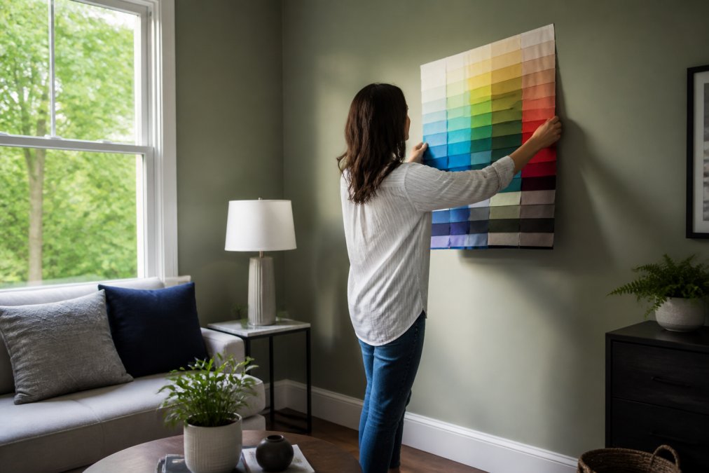
Lighting conditions change how every color looks, and the shift follows predictable patterns based on light temperature and direction. Understanding these mechanics is the difference between a color that looks perfect in the store and one that feels wrong in your living room.
How Light Temperature (Kelvin) Changes Color Perception
Every light source has a color temperature measured in Kelvin (K). Lower Kelvin numbers produce warm, orange-tinted light; higher numbers produce cool, blue-tinted light. Standard household incandescent bulbs sit around 2700K, which casts a warm amber glow that makes reds and oranges look richer but can make cool blues and greens appear muddy. Daylight, which averages 5500K to 6500K, is neutral and shows colors closest to their true pigment.
This matters for colorful decor because a cobalt blue vase viewed under a 2700K lamp will look darker and slightly greenish, while the same vase under a 4000K ceiling light will appear brighter and more true to its pigment. Before you buy, identify which light source will dominate the area where the piece will sit.
Natural Light Shifts Throughout the Day
Sunlight is not constant. North-facing windows receive cool, diffused light all day, which makes warm colors appear flatter and cool colors appear more vibrant. South-facing windows get strong, warm direct light for most of the day, which intensifies reds, oranges, and yellows but can wash out pastels. East-facing rooms are bright in the morning with a warm cast and turn dimmer and cooler by afternoon.
To preview accurately, hold your physical swatch or fabric sample in the exact spot where the item will live, at three specific times: 9:00 AM, 1:00 PM, and 7:00 PM (or whenever you typically use the room with lamps on). Photograph the swatch at each time with the same phone camera.
Undertones: Warm vs. Cool in Practice
Undertone is the subtle hue beneath a color's dominant shade. A beige throw pillow can have a pink, yellow, or green undertone, and each will react differently to your lighting. A pink-toned beige will look rosy and warm under incandescent light but can turn gray and lifeless under cool daylight.
To test undertones, place your swatch next to a pure white piece of paper. The paper gives your eye a neutral reference point, making the undertone obvious. Then repeat the test next to your wall color and your largest furniture piece.
A Simple Lighting Test Kit
Assemble a small kit before you shop: a 2700K LED bulb in a portable lamp, a 4000K LED bulb in another lamp, and a piece of white printer paper. When you bring a swatch or sample home, view it under both bulbs and in natural daylight. If the color looks good in all three conditions, it will work in your room regardless of the time of day.
How to Mix and Match Colorful Decor Like a Pro
Mixing and matching colorful decor is a skill that balances visual interest with a clear structure. The key is to vary scale, texture, and color intensity across your pieces. Pair a large, bold accent pillow with smaller, quieter accessories, and mix smooth surfaces with textured ones.
A practical approach is to group items in odd numbers, like three pillows or a cluster of five vases, because odd groupings feel more organic. Choose one hero piece that carries the boldest pattern or color, then let the other items support it. Artificial intelligence can effectively analyze design elements like artwork and wall colors to categorize living room decor styles, according to Pennsylvania State University research on AI in interior design, which confirms that successful rooms follow recognizable patterns of color coordination rather than random placement.
Low-Cost Physical Hacks to Visualize Decor at Home
When you want to visualize colorful decor without spending money on apps or samples, physical DIY hacks give you a tangible preview. Print product photos at scale, cut them out, and place them in your room to see how the size and color work against your actual furniture and walls. Or use large sheets of colored paper or fabric remnants as stand-ins for accent pieces.
For furniture, trace the item's dimensions onto cardboard and cut it to size, then position the mockup where the piece would go. This gives you an accurate sense of scale and proportion without moving anything heavy.
Conclusion: Buy Colorful Decor with Confidence
Visualizing colorful decor before buying is not about eliminating risk entirely, it is about reducing surprises so that the pieces you choose genuinely delight you. By building a color story, measuring your space, testing lighting, and using the digital and physical tools we have covered, you can shop with a clear picture of how each item will perform in your home. At theJoyincolor, our curated collection is designed for people who love color and want pieces that function beautifully in daily life. Get started with theJoyincolor and bring home decor you have already visualized.
Frequently Asked Questions
What is the best color visualizer to use?
The best room visualizer apps for colorful decor include platforms like Sherwin-Williams' ColorSnap and Houzz's View in My Room. These tools use your phone's camera to place virtual furniture and paint colors directly onto your wall. For the most accurate preview, pick an app that lets you upload your own photo rather than using a generic room template. This way, you can see how the color interacts with your specific lighting and existing furniture before you commit.
How do I create a mood board for colorful home decor?
Start a home decor mood board by collecting images of rooms, textiles, and art that share a similar color palette. Digital tools like Pinterest or Canva make this easy, but a physical corkboard works too. Focus on gathering swatches of your main colors, including patterns, and note the proportions of each color in the images you like. This visual collection helps you identify a consistent color story and prevents you from buying mismatched pieces.
How do I use the 60/30/10 rule when mixing colorful decor?
The 60/30/10 rule is a simple framework for mixing colorful decor. Use your dominant color for 60 percent of the room, which usually covers walls and large furniture. A secondary color should take up 30 percent for pieces like rugs and curtains. The remaining 10 percent is for bold accent colors found in pillows, art, and vases. This ratio creates a balanced, cohesive look without letting bright colors overwhelm the space.
Can I visualize colorful decor using my phone's camera?
Yes, augmented reality (AR) apps let you visualize colorful decor with your phone's camera in real time. Apps like IKEA Place and Amazon's AR View allow you to place 3D models of furniture and decor into your actual room. Point your camera at the corner where you plan to put a new piece, and the app will show you how it fits. This method helps you test scale, proportion, and color coordination without moving a single item.