

Table of Contents
- Why Some Paint Colors Read as Expensive (and Others Don't)
- Paint Colors That Increase Home Value: What the 2026 Data Shows
- Warm Neutrals, Greige, and the New Off-White Palette
- Moody Accents: Navy, Burgundy, and Deep Olive for Visual Depth
- Best Paint Finishes for a Premium Look
- How to Make a Room Look Expensive on a Budget
- Colors That Make a House Look Cheap (and What to Paint Instead)
- Conclusion
- Frequently Asked Questions
Last Updated: October 1, 2026
Why Some Paint Colors Read as Expensive (and Others Don't)
According to Zillow (2026), painting a kitchen charcoal gray can raise a buyer's offer price by nearly $1,373. What color makes a house look expensive? It isn't a matter of taste but of value, and buyers are quietly pricing it in.
Paint Colors That Increase Home Value: What the 2026 Data Shows
The colors that increase home value in 2026 share a common trait: they read as deliberate. According to Zillow's 2026 paint color analysis, specific shades correlate directly with higher offer prices, and the winners aren't the obvious ones.
Charcoal Gray in the Kitchen
Charcoal gray is the strongest kitchen performer, adding a potential $1,373 to a buyer's offer price (Zillow, 2026). It's dark enough to feel bespoke but neutral enough to survive a decade of trends. Pair it with warm wood and brass hardware and the room reads as custom; pair it with cool gray floors and it reads as a flipped rental.
Midtone Gray and Sage Green
Midtone gray can lift a home's sale price by up to $2,553 (Zillow, 2026). Sage green is the only shade to rank in the top tier for resale value in every room of the house, according to the same Zillow research.
| Color | Room | Potential Impact | Why It Works |
|---|---|---|---|
| Charcoal gray | Kitchen | +$1,373 | Depth without trend risk |
| Midtone gray | Interior | +$2,553 | Warm, flexible neutral |
| Sage green | Every room | Top-tier resale | Earthy, muted undertones |
| Warm chocolate brown | Bedroom | Increases value | Warmth and richness |
| Ochre yellow | Any room | -$18,000 | Oversaturated, dated |
Warm Neutrals, Greige, and the New Off-White Palette
Warm neutrals are dominating 2026 color collections. HGTV Home by Sherwin-Williams built its 2026 palette around shades like Neutral Ground and Creamy, a clear signal that the clean-canvas look is back, but warmer.
Moody Accents: Navy, Burgundy, and Deep Olive for Visual Depth
Deep, moody colors are the fastest route to understated elegance, and the reason is mechanical: dark pigments absorb more light than they reflect, so a navy or deep olive wall produces soft shadow gradients instead of the flat bounce of a light neutral. That gradient is what the eye reads as richness.
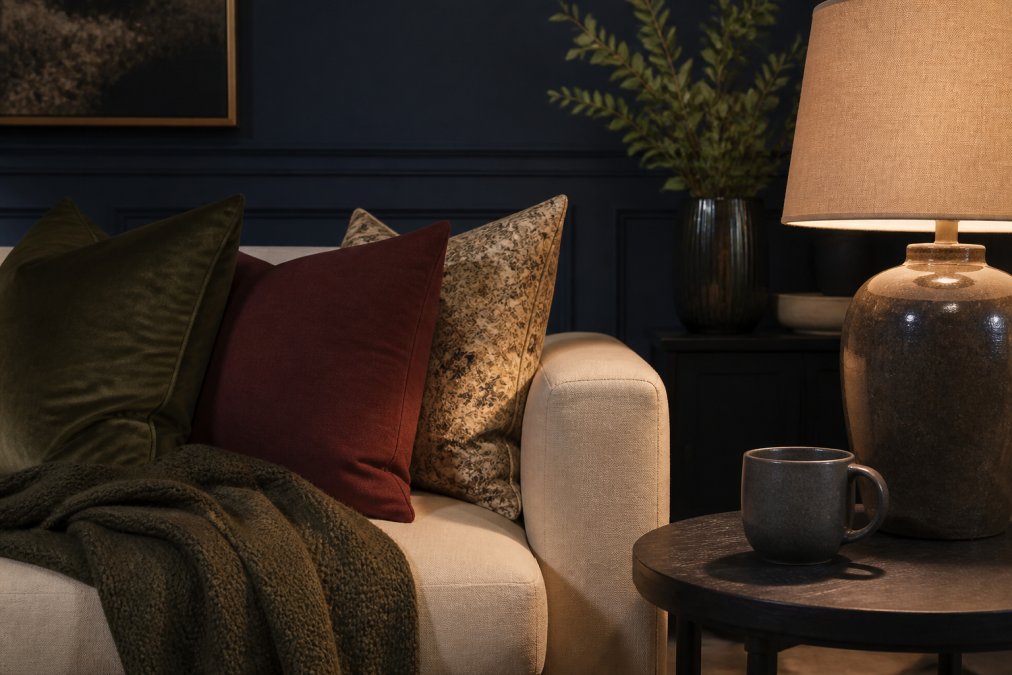
Undertone temperature decides whether the accent reads rich or cheap
Midnight blue with a green undertone reads antique and expensive; with a purple undertone it reads 2014 and dated. Deep olive with a yellow-brown base reads earthy and custom; with a gray base it reads muddy. The shade name on the can tells you almost nothing, the undertone does. A practical test: hold the sample chip against a pure white sheet of paper in daylight.
Texture is what separates a painted wall from a designed one
This is the piece most color guides skip. Paint color and fabric texture interact, and that interaction produces the 'expensive' read. A low-LRV navy wall with a matte linen sofa looks layered and considered; the same wall with a shiny polyester blend looks like a rental. Velvet absorbs light the way dark paint does, so a deep olive wall next to a velvet chair compounds the depth.
Room size changes the rule
An accent wall is the cheapest way to test this, and one wall in midnight blue changes how every other color in the room reads. It also makes the room feel larger, not smaller: a dark wall recedes visually, so the eye reads the room as extending past the light-colored walls into the darker plane. That effect has limits. In a small powder room, a full low-LRV wrap (all four walls plus ceiling) reads as jewel-box luxury; in a large living room, the same wrap can feel like a cave.
All the Loves Graffiti Love-Black →
Best Paint Finishes for a Premium Look
The best paint finishes for a premium look are satin and eggshell on walls, semi-gloss on trim, and matte on ceilings. Finish controls sheen, and sheen controls how expensive a room feels. But 'satin' and 'eggshell' mean different things across brands, so think in sheen level instead, measured in gloss units on a 0-100 scale.
The sheen scale, in plain terms
- Flat / matte (0-10 gloss units): Almost no reflection. Hides drywall imperfections and looks richest in low light. Scuffs easily and is hard to clean without leaving a burnish mark.
- Eggshell (10-25 gloss units): A soft, low sheen. The practical middle ground for high-traffic rooms because it wipes clean without looking shiny.
- Satin (25-40 gloss units): Noticeably reflective. Makes color look more saturated and slightly darker than the chip, and highlights every bump in the drywall.
- Semi-gloss (40-70 gloss units): The standard for trim, doors, and cabinets. Durable, scrubbable, and it makes millwork read as crisp and deliberate.
- High-gloss (70+ gloss units): A statement finish. On walls it shows every flaw; on trim and doors it reads as lacquered and custom.
The trade-off nobody explains
Here's the trade-off. Matte hides wall imperfections and looks richer in low light, but it scuffs easily. Satin wipes clean and reflects light, making color look more saturated, but it highlights every bump in the drywall. No finish does both, the choice is always between forgiving the wall and forgiving the color. A common pattern among designers working on older homes: flat or matte on walls, semi-gloss on trim, and a higher-gloss finish on doors than on trim.
Finish changes the color you see
The same paint chip looks different in every sheen. A satin wall reflects more light back at the eye, so the color appears slightly more saturated and darker than the chip; a flat wall scatters light, so the color appears softer and lighter. That's why two rooms painted the same shade can look like two different colors, the finish, not the paint, is doing the work.
Room-specific finish picks
- Kitchen: Eggshell on walls (grease wipes off), semi-gloss on cabinets and trim. A charcoal kitchen in eggshell reads bespoke; the same charcoal in high-gloss reads commercial.
- Bathroom: Satin on walls to handle humidity, semi-gloss on trim. Matte in a bathroom traps moisture and mildew.
- Bedroom: Matte or flat on walls for the softest light, semi-gloss on trim. This is the one room where flat is almost always the right call.
- Living room: Eggshell on walls, semi-gloss on trim, and consider a gloss or lacquer finish on a single door or built-in to anchor the palette.
- Powder room: A full low-LRV wrap in eggshell or satin, the slight sheen makes a small dark room feel jewel-box rather than cave-like.
How to Make a Room Look Expensive on a Budget
You don't need to repaint the whole house. To make a room look expensive on a budget, focus on contrast, texture, and one strong color decision.
- Pick one accent wall in a moody shade instead of painting all four
- Upgrade trim and baseboards with semi-gloss in the same undertone
- Swap builder-grade hardware for a single consistent finish
- Layer in texture: linen, ceramic, and matte finishes break up flat color
- Add one deep-toned object, like a glossy black ceramic mug, to anchor the palette
Colors That Make a House Look Cheap (and What to Paint Instead)
Ochre yellow is the clearest offender: it can lower a home's sale price by as much as $18,000 (Zillow, 2026). Oversaturated, dated, and hard to coordinate, it's the opposite of a curated palette. Other cheap signals show up in the details:
- Cool gray overused in every room, which reads as flipped rather than designed
- Bright primary colors on large surfaces instead of muted, earthy tones
- Mismatched undertones between walls, trim, and ceilings
- High-gloss walls that show every imperfection
Conclusion
Choosing what color makes a house look expensive comes down to control: muted saturations, matched undertones, and one deliberate dark accent. Get those right and the room reads as curated, whether you spent $200 or $20,000.
Frequently Asked Questions
What color house looks the most expensive?
Charcoal gray and sage green consistently rank highest in 2026 data. Zillow found charcoal gray kitchen walls could raise a buyer's offer by nearly $1,373, and sage green was the only shade to rank in the top tier for resale value in every room. Midtone gray also performed well, with potential sale price increases up to $2,553. These shades read as expensive because they add visual depth and contrast rather than sitting flat on the wall.
Do dark colors make a room look more expensive?
Yes, when used with intention. Deep navy, burgundy, and olive green create richness and visual depth that flat neutrals can't match. Style by Emily Henderson notes that rooms without darker balancing tones can feel unfinished. The key is contrast: pair a moody accent wall with lighter trim or off-white ceilings so the space feels curated rather than closed in. Dark colors work best in rooms with good ambient lighting.
What color house is hardest to sell?
Ochre yellow is the biggest risk. Zillow's 2026 analysis found it can lower a home's sale price by as much as $18,000. Highly saturated or trend-driven shades that don't match a neutral palette tend to narrow your buyer pool. If you love bold color, keep it in removable elements like art, textiles, or a glossy ceramic mug rather than committing it to walls you'll need to repaint before listing.
How can I make a room look expensive on a budget?
Start with one well-chosen wall color instead of repainting everything. A single charcoal or deep olive accent wall costs far less than a full room and delivers the contrast that reads as high-end. Then upgrade the details buyers notice: swap builder-grade switch plates, add a matte finish on walls and satin on trim, and layer in small curated pieces like theJoyincolor's glossy ceramic mugs ($10.50 to $12.63) to add color without a renovation.