

Table of Contents
- The Big Shift: Why Colorful Interior Design Trends 2026 Are Richer and Bolder
- Color Drenching and Moody Palettes: The Defining Look of 2026
- Color Psychology in Interior Design: How Hues Change Your Mood
- Vibrant Color Palettes for Living Rooms: From Accent Walls to Accessories
- Earthy Tones, Lacquered Finishes, and Reflective Accents
- Budget-Friendly Ways to Try Colorful Interior Design Trends 2026
- How to Make These Trends Last Beyond 2026
- Frequently Asked Questions
Last Updated: September 7, 2026
Designers are moving toward "intense and refined" palettes that create personality-driven, welcoming environments (Bontempi, 2025). This is the essence of colorful interior design trends 2026: a deliberate move toward richer, more expressive combinations that make a home feel curated rather than catalog-ordered. Bold color is no longer a risk, it is the point.
Below, we'll show you exactly how to apply these trends, from full-room color drenching to budget-friendly accent swaps. But first, here's what most guides get wrong: they treat color as decoration. In 2026, color is the architecture of the room.
The Big Shift: Why Colorful Interior Design Trends 2026 Are Richer and Bolder
The minimalist era of cool grays and clinical whites is giving way to warmer tones, including beiges and creamier shades, which serve as foundations for bolder statements (Sierra Living Concepts; JRL Interiors, 2026) (sierralivingconcepts.com). This isn't a return to maximalism's clutter, but rather a homespun aesthetic that feels lived-in and personal.
Colorful interior design trends 2026 are defined by a few key forces:
- A reaction against sterile, impersonal interiors
- A desire for spaces that feel like sanctuaries, not showrooms
- An embrace of materials and colors that age gracefully
Behavioral research has identified environmental factors that foster security, inspiration, and connection in interior spaces (Ware Malcomb, 2026). Your color choices shape how you feel at home, shifting from "what looks expensive" to "what feels right."
Color Drenching and Moody Palettes: The Defining Look of 2026
Color drenching is the technique of covering walls, trim, and ceilings in a single color, and it is appearing across design media as a dominant strategy (Quartz, 2026) (qz.com). The effect is immersive and dramatic, turning a room into a cohesive, monochromatic environment.
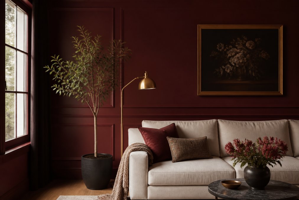
Designers call this "moody drenching," and it pairs deep, saturated color applications with reflective accents to create depth and atmosphere (Elle Decor, 2025). Think oxblood walls with a brass mirror, or deep teal cabinetry with copper fixtures. The reflective accents catch light and prevent the room from feeling like a cave.
For 2026, the palette is shifting toward "merlot reds, oxblood, plum and deep teal layered with" complementary textures (Luxe Interiors + Design, 2026). These are not shy colors. They are confident, enveloping choices that make a room feel intentional.
How to Mix Colors in Home Interior Design Without Clashing
The most common fear is that bold colors will clash. The fix is a strategy called "material tension": pairing colors with contrasting textures to create visual interest without conflict.
A practical approach is the 60-30-10 rule:
- 60% dominant color (walls, large furniture)
- 30% secondary color (upholstery, rugs)
- 10% accent color (pillows, art, ceramics)
This framework works because it gives each hue room to breathe. When you mix colors in home interior design, you're not just picking shades; you're distributing visual weight. A deep merlot wall (60%) paired with a cream sofa (30%) and burnt-orange pillows (10%) feels balanced, not chaotic.
Color Psychology in Interior Design: How Hues Change Your Mood
Most articles stop at saying 'blue is calming.' That is not useful in a paint aisle. The real question is how a color behaves in your specific room, with your light, at your scale. The 2026 palettes are not just about hue, but about saturation and value, which are the levers that drive psychological response.
The Mechanism: Saturation and Value Over Hue
Research shows that the intensity (saturation) and lightness (value) of a color have a stronger impact on mood than the specific hue itself. A muted, dusty blue reads as restful; the same blue at full saturation reads as electric. Deep, low-value shades of merlot, forest green, and navy create a sense of enclosure and security because they reduce visual noise and lower perceived brightness, the same principle behind why dark, chalky bedroom tones are reported to improve sleep quality.
The Lighting Variable
Your paint color is only half the equation. The same terracotta wall looks different under warm incandescent light versus cool daylight from a north-facing window. Test your shade in the actual room at morning, midday, and evening. A color that looks invigorating at noon can feel oppressive at 8 PM if your lighting is too dim or too warm. The fix is often a brighter, higher-CRI bulb that renders the pigment accurately.
Room-by-Room Application for 2026 Palettes
Here is how the 2026 colors translate into specific psychological outcomes, based on how these wavelengths are processed:
- Living Rooms (Merlot, Oxblood, Deep Teal): These colors lower heart rate and encourage a 'settling in' feeling, which is why they are favored for spaces meant for conversation and winding down. The key is to pair them with a high-contrast accent, like a cream sofa or brass lamp, to prevent the space from feeling heavy.
- Home Offices (Deep Green, Slate Blue): These hues are associated with sustained focus rather than high-energy creativity. They reduce eye strain compared to stark white walls, which is a practical benefit for anyone staring at a screen all day. Avoid bright reds or oranges here; they are linked to increased alertness and can be distracting over long periods.
- Entryways (Burnt Orange, Ochre): This is the place to use your most energizing color. You are in the space for seconds, not hours, so a high-saturation, warm tone provides a welcoming jolt of optimism that carries into the rest of the home.
- Bedrooms (Muted Clay, Dusty Sage): The goal is a color that feels grounding without being stimulating. High-value (lighter) versions of earthy tones are the safest bet, as they reflect more light and prevent the room from feeling like a cave at night.
The Personal Baseline
There is no universal 'happy color.' Your personal history and cultural background heavily influence your response. Identify the feeling you want in a room, focused, relaxed, energized, and select a color from the 2026 palette that you personally associate with that feeling. The trend is a starting point; your lived experience is the final filter.
Vibrant Color Palettes for Living Rooms: From Accent Walls to Accessories
Vibrant color palettes for living rooms in 2026 are about creating a focal point without overwhelming the space. A saturated accent wall behind the sofa is a classic move, but the trend is pushing further: consider painting the built-in shelving, the fireplace surround, or the door frames.
A simpler entry point is accessories. The Mothers Day Accent Pillow ($17.13) is a perfect example. Its multicolor abstract art introduces several hues at once, giving you a palette to pull from for the rest of the room. The machine-washable case and shape-retaining insert mean it works for daily use.

For a more cohesive look, pair bold pillows with a neutral sofa. This creates a pop of color that is easy to swap out when you want a refresh.
| Element | Color Strategy | Example |
|---|---|---|
| Walls | Color drenching or accent wall | Deep teal or merlot |
| Large furniture | Neutral anchor | Cream or beige sofa |
| Textiles | Introduce pattern and hue | Multicolor accent pillows |
| Lighting | Reflective accents | Brass or copper fixtures |
Earthy Tones, Lacquered Finishes, and Reflective Accents
The balance to moody drenching comes from earthy, natural palettes paired with organic, sculptural shapes (Woodgrain, 2025). Terracotta, ochre, and sage provide a grounding counterpoint to deeper jewel tones, making a space feel soft and connected to the natural world.
Lacquered finishes are a growing trend, appearing on both furniture and walls (Style by Emily Henderson, 2026) (stylebyemilyhenderson.com). The high-gloss surface reflects light, adding depth and movement that matte finishes lack, this is where the "reflective accents" of moody drenching come into play.
A lacquered side table in a deep plum, or a glossy ceramic vase in burnt orange, adds that touch of sophistication without requiring a full renovation. The finish catches the light and adds a layer of visual interest that flat paint cannot replicate.
Budget-Friendly Ways to Try Colorful Interior Design Trends 2026
The biggest misconception about the 2026 color trends is that they require a full renovation or a designer budget. The most impactful changes are often the cheapest, because they involve paint, fabric, and rearranging what you already own. Here is a practical, tiered approach that costs less than a dinner out for two.
Tier 1: The $50 Paint Test
Paint is the single most cost-effective way to test a moody color. A single gallon of high-quality paint costs between $40 and $60 and will cover an accent wall or a small powder room. Do not paint an entire room first. Instead, paint one wall, or even better, the inside of a bookshelf or a built-in alcove. This gives you a daily, low-commitment view of how the color behaves in your light. If you love it after two weeks, expand; if not, a coat of primer erases the experiment.
Tier 2: The $100 Textile Swap
Textiles are the fastest way to change the color temperature of a room. The key is to buy in a coordinated set, not a single item. A lone red pillow on a gray sofa looks like an accident; three pillows in varying shades of merlot, rust, and cream look intentional. Look for:
- Pillow covers: Buying just the covers, not new inserts, can cut the cost by half. A standard 18x18-inch cover costs $10 to $20.
- A throw blanket: Draped over the back of a sofa or chair, this adds a large block of color for $25 to $40.
- A table runner: An inexpensive way to introduce a bold pattern without committing to a full set of curtains or a new rug.
Tier 3: The $150 Furniture Flip
Before you buy anything new, look at what you have. A dated wooden side table or a plain IKEA bookshelf can be transformed with a single can of spray paint or a quart of high-gloss enamel. A glossy coat of deep plum or emerald green on a thrifted side table creates a designer look for under $30, and keeps furniture out of landfills.
The Color Drenching Hack for Renters
You cannot paint your walls, but you can still get the immersive effect of color drenching. Use removable, peel-and-stick wallpaper on a single focal wall, or drape a large, inexpensive piece of fabric, like a canvas drop cloth dyed in a deep color, from a curtain rod. This creates the same enveloping effect without a permanent change.
The 30-Day Rule
Before you spend money on a large, permanent piece like a colored sofa or a patterned rug, use the '30-day rule.' Live with a temporary version first, drape a colored sheet over your current sofa, or lay down a cheap, colorful rug. If you still love the color after a month, it is worth the investment. If you are tired of it after a week, you have saved yourself hundreds of dollars.
The goal of these trends is not to replicate a magazine spread; it is to make your home feel more like you. Starting small, testing cheaply, and building up gradually is the most sustainable, and budget-friendly, way to get there.
How to Make These Trends Last Beyond 2026
Trends come and go, but a well-chosen palette can feel fresh for years. The secret is to invest in timeless base pieces and use trends for the accents. A cream sofa is timeless; a merlot red sofa is a commitment.
The reaction against design fatigue suggests a desire for spaces that feel authentic, not staged (Vogue; Instagram, 2026). To make your colorful choices last, focus on a timeless palette for large surfaces and rotate accessories seasonally. This gives you the joy of color without the cost of a full redecoration every year.
The multicolor abstract art on the accent pillows provides a palette that can be echoed in vases, throws, and wall art. This creates aesthetic cohesion across your space.
Bringing color into your home is a process of discovery, not a single purchase. Start with one accent piece that speaks to you, build your palette around it, and let the space evolve. The theJoyincolor collection offers the vibrant, high-quality pieces you need to test these trends without overhauling your entire home.
Frequently Asked Questions
What will be the most popular interior color in 2026?
Expect to see deep, saturated tones like merlot red, oxblood, plum, and deep teal leading the way. These rich hues are replacing the cool grays that dominated recent years. Alongside these moody colors, warm neutrals such as beige and creamy white remain popular as a base. The 2026 approach pairs these intense shades with earthy, natural tones to create spaces that feel both expressive and welcoming.
How can I incorporate bold colors into a small room?
Try color drenching: paint the walls, trim, and ceiling in one bold shade to make the space feel larger and more cohesive. Use reflective accents like brass or mirrored decor to bounce light around. Add vibrant textiles such as accent pillows or a patterned hand towel. These colorful interior design trends 2026 work well in compact areas without overwhelming them.
Are maximalist color palettes still trending in 2026?
Yes, but with more intention. The 2026 look favors intense and refined palettes over random clutter. Designers are pairing saturated colors like deep teal with sculptural shapes and layered textures. Color psychology in interior design also plays a role: choose hues that create the mood you want. This approach offers the energy of maximalism while keeping a curated, cohesive feel.
What color is replacing grey in 2026?
Warm neutrals are taking over from cool grays. Designers are shifting toward beiges, creamier shades, and soft stone tones as a foundation. These warmer bases pair naturally with the year's bold accent colors, like oxblood and plum. If you have gray walls, you can update the look by adding warm-toned accessories or an accent pillow in a vibrant color to bridge the transition.